sketch London: Design Icon Updated
London's most talked about destination for food, drinks, art and music has been upgraded with even more vibrancy, character and charm.
The quirky, 18th-century townhouse on Conduit Street in London's affluent Mayfair district is known for its unique and artistic interiors, from the pastel pinks of the Gallery to the world-famous egg pod toilets. Keeping things fresh, a series of exciting upgrades have been made to the venue's restaurant areas, and it is safe to say that the spaces have never looked better. While many places are left to fade away into the distance, sketch continues to go from strength to strength, attracting crowds from across the globe. After completing a design review back in 2016 'sketch London: The Design Icon', explore the interior transformations below.
The Glade
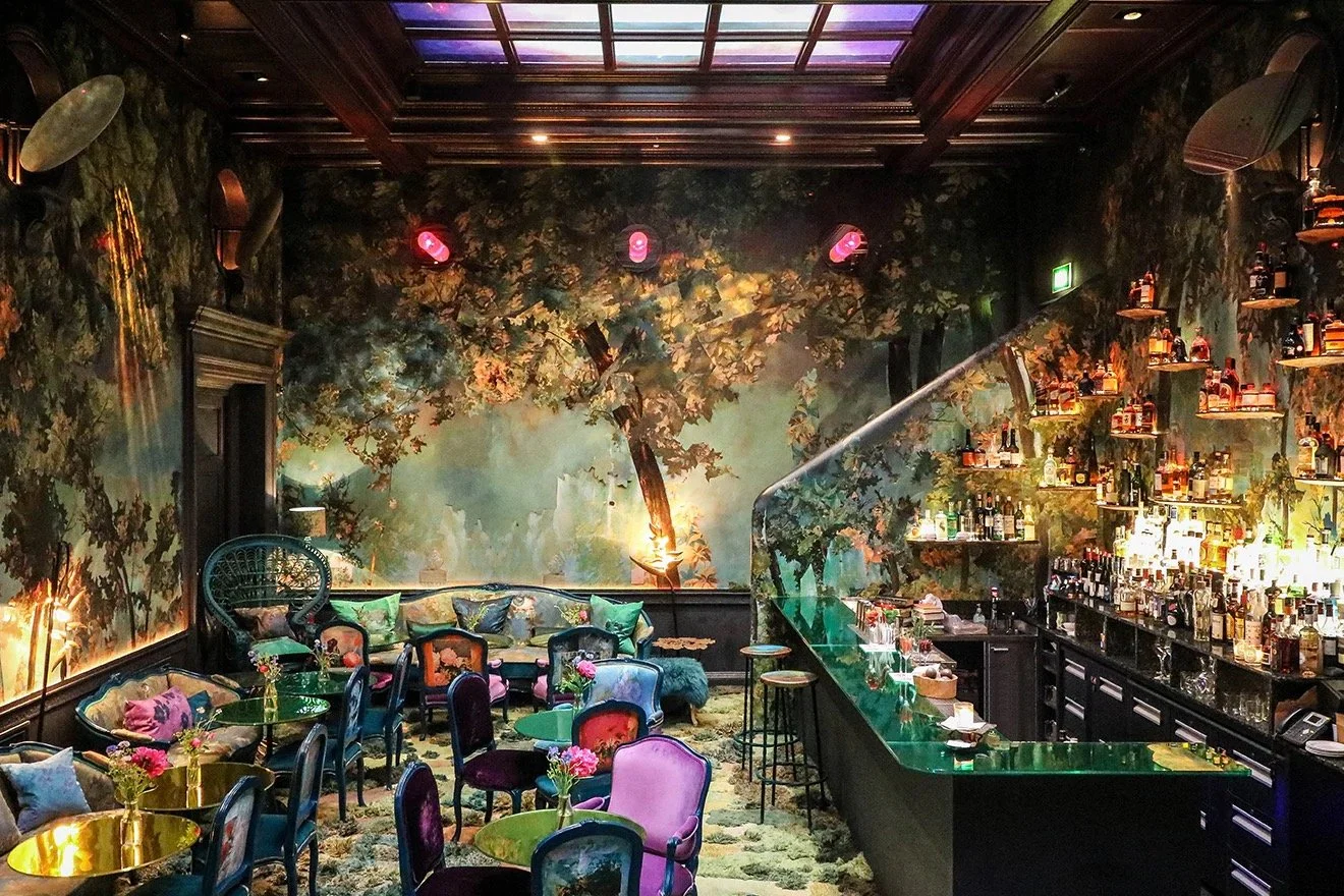
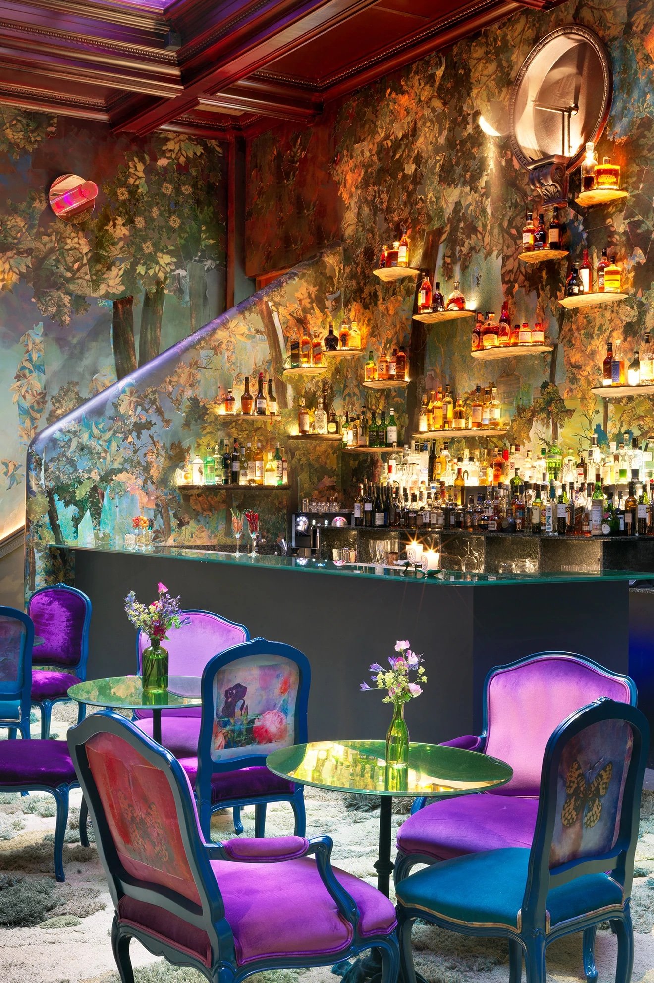
A hidden wilderness nestled between the canopies of the trees, the Glade restaurant has been transformed into a vibrant and eccentric world, fit for a fairytale. The wooden floor has been carpeted with an exclusive one of a kind design by Argentine artist Alexandra Kehayoglou, presented as a beautiful landscape of trees and fields as viewed from above. Vibrant furniture replaces the original 50's rattan furniture including dining chairs and sofas finished in blue lacquer with vibrant upholstery in purple and blue hues. Emphasising the height of the interior, the bar shelving on the back wall has been extended upwards at varying heights and illuminated from behind to create an enchanting feature for the room.
The Lecture Room & Library
The venue's Michelin star dining room has replaced its beautiful golden tones for something a little softer on the eye. White decorative wallcoverings compliment the original red detail, mixing to produce a delicate pastel pink theme. All attention directs toward the interior's impressive ceiling, adorned with traditional mouldings completed in silver, pink and blue paintwork. The Lecture Room & Library is a melting pot of traditional and contemporary design, producing a unique and instantly recognisable style, one of the many jewels in sketch's crown.
The Gallery
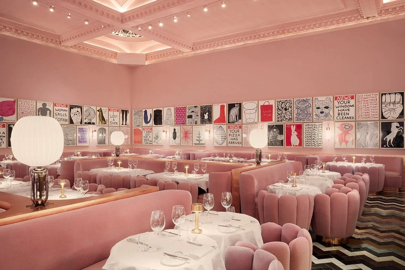
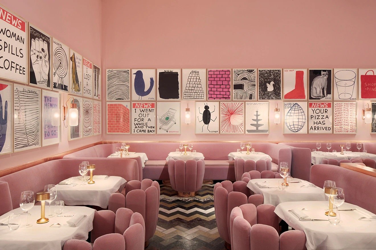
Designed by India Magdavi back in 2014, The Gallery needs no introduction, being known the world through as London's iconic pink restaurant. At only four years old and as the name suggests, the Gallery is a space to view and admire art. From the start of 2018, acclaimed British artist David Shrigley is replacing his 239 black & white drawings prominently featured on the walls of the restaurant with 91 colourful new works. While the interior itself has not changed, the new pieces inject new character into this much-loved restaurant, a brilliant example of the powers of art.
The Parlour
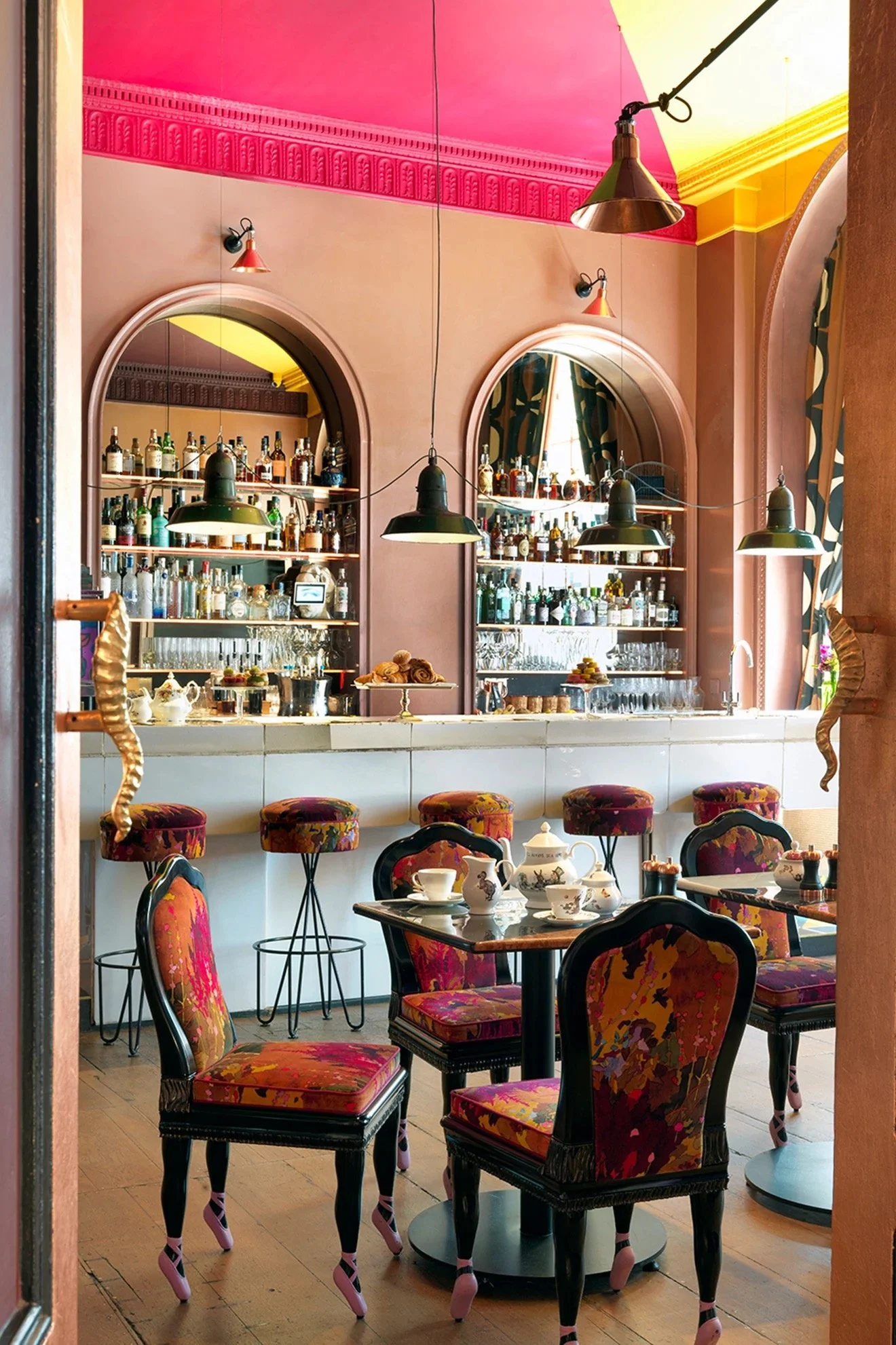
Undergoing the most striking transformation, proprietor Mourad Mazouz and designer Andres Ros Soto redesign the Parlour. Bold patterns and quirky details reminiscent of early 90’s decadence fill the interior, a feast for visitor’s eyes as they are drawn from the ballet shoe legs of the dining chairs, up towards the bright painted segments of the ceiling with decorative mouldings replicated in neon lighting. The multifunctional space takes on new personas throughout the day, evolving from a patisserie in the morning to a dancer's paradise during the evening.
Egg Loos
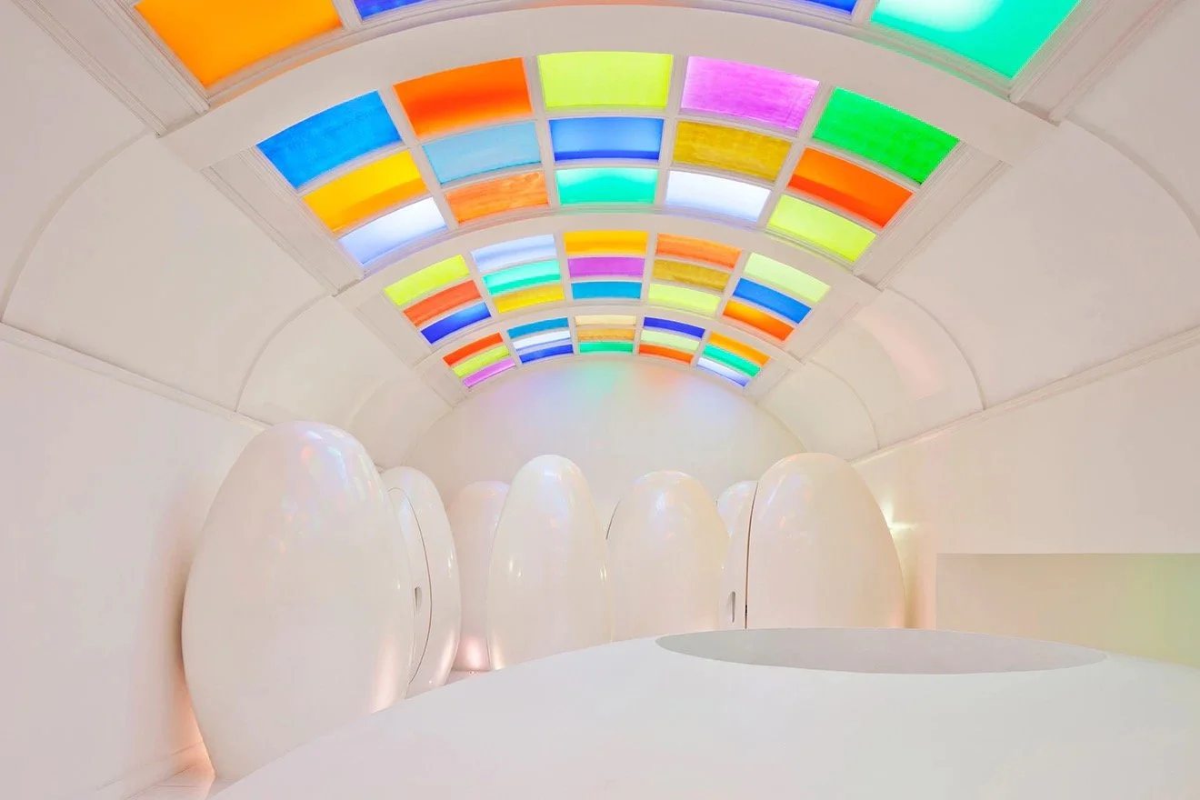
It would not be a design feature without mentioning the fun and somewhat mysterious pod toilets. A staple for the sketch experience, visitors make their way up the curved staircases above the East Bar into a large white room, framed by its multi-coloured glass ceiling and full of egg-shaped pods. With the unwritten rule "Always judge a restaurant by its toilets" it is safe to say that a visit to sketch will take you out of this world.

