André Fu Studio - The Cellar at the Andaz Singapore.
Hong Kong-based studio André Fu designs the interiors of ‘The Cellar’– an expansion and additional restaurant to the hugely popular 665°F, Andaz Singapore, extending the dining capacity into a former engineering plant-room.
665°F has been one of the marquee restaurants in Andaz Singapore since the hotel opened in 2017. Designed by the Hong Kong-based André Fu Studio, the space features a winning combination of juicy prime cuts grilled in a Pira oven that’s heated to the eponymous 665°F, a lofty timber-lined ceiling anchored by a dramatic chandelier of globed lamps, and flawless views of Singapore’s skyscrapers and the sea beyond.
The popularity of the menu means that the restaurant, which seats just 30, is invariably filled to capacity - a happy problem now resolved by the addition of The Cellar, which is also designed by André Fu Studio.
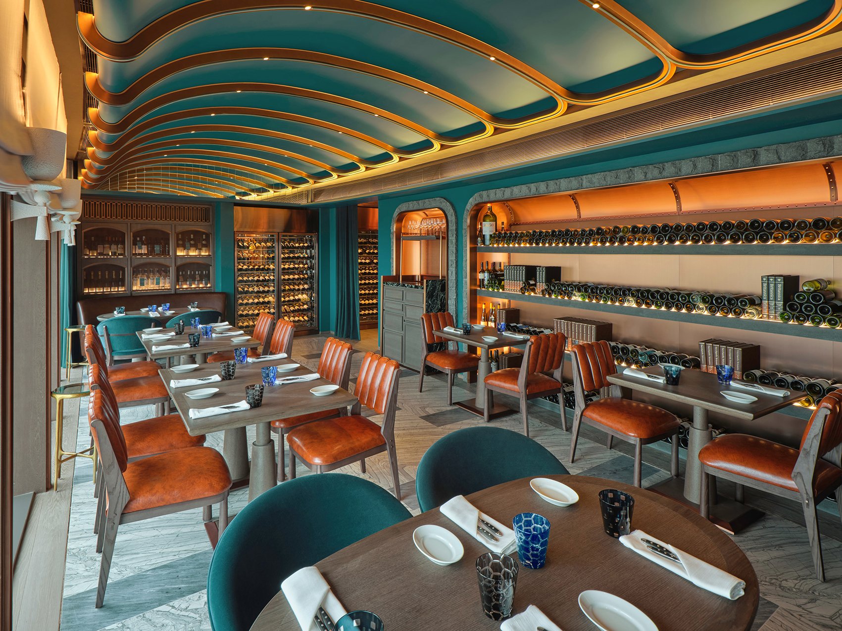
Somewhat unusually, the narrow 1,300-square-foot space was, until recently, the engineering plant-room that adjoined 665°F’s principal dining room, its potential now fully unfolded in a remarkable modern take on the classic cellar that holds not just 400 bottles of premium Old and New World labels, but also seats 20 diners in the main dining hall and another eight in an adjoining private room.
“Once all the machinery had been cleared out, our first impression was that its rectangular shape was reminiscent of a cellar,” recalls the studio’s founder and creative director, Fu. “But cellars are typically located below ground. So, the design proposition became this idea of bringing the cellar up 38 floors into the sky. What kind of cellar would this look and feel like?”
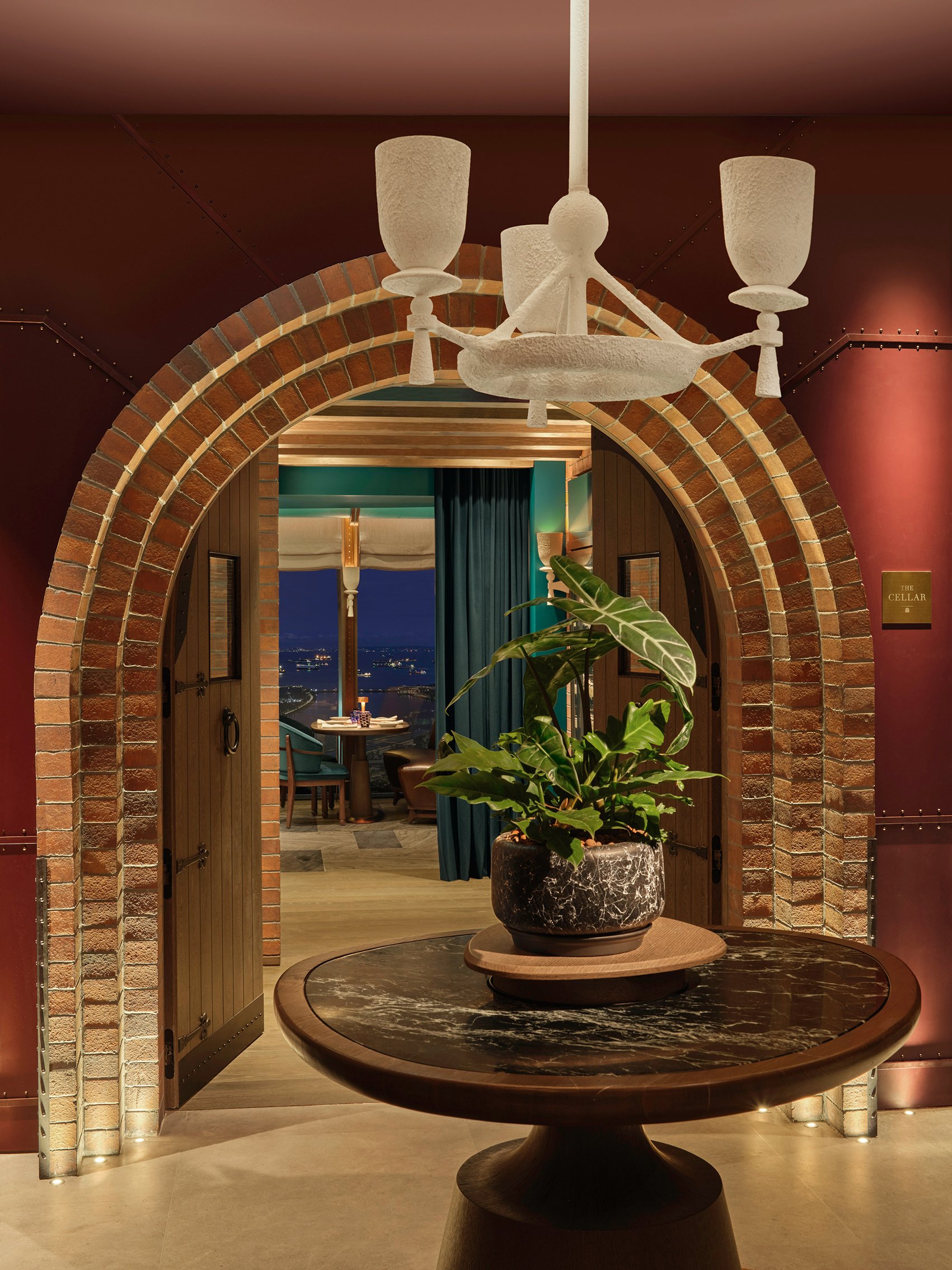
The answer is a dramatic sequence of spaces that begins unfurling from the first step into the mood-lit entrance. Burgundy-hued and timber-lined, The Cellar’s bijou foyer is anchored by a vaulted ceiling over a smoky mirrored corridor, a round reception table, cast-white metal pendant lamp, and a tufted Persian- inspired rug that’s a whimsical homage to the carpet-shops of the hotel’s Kampong Glam neighbourhood.
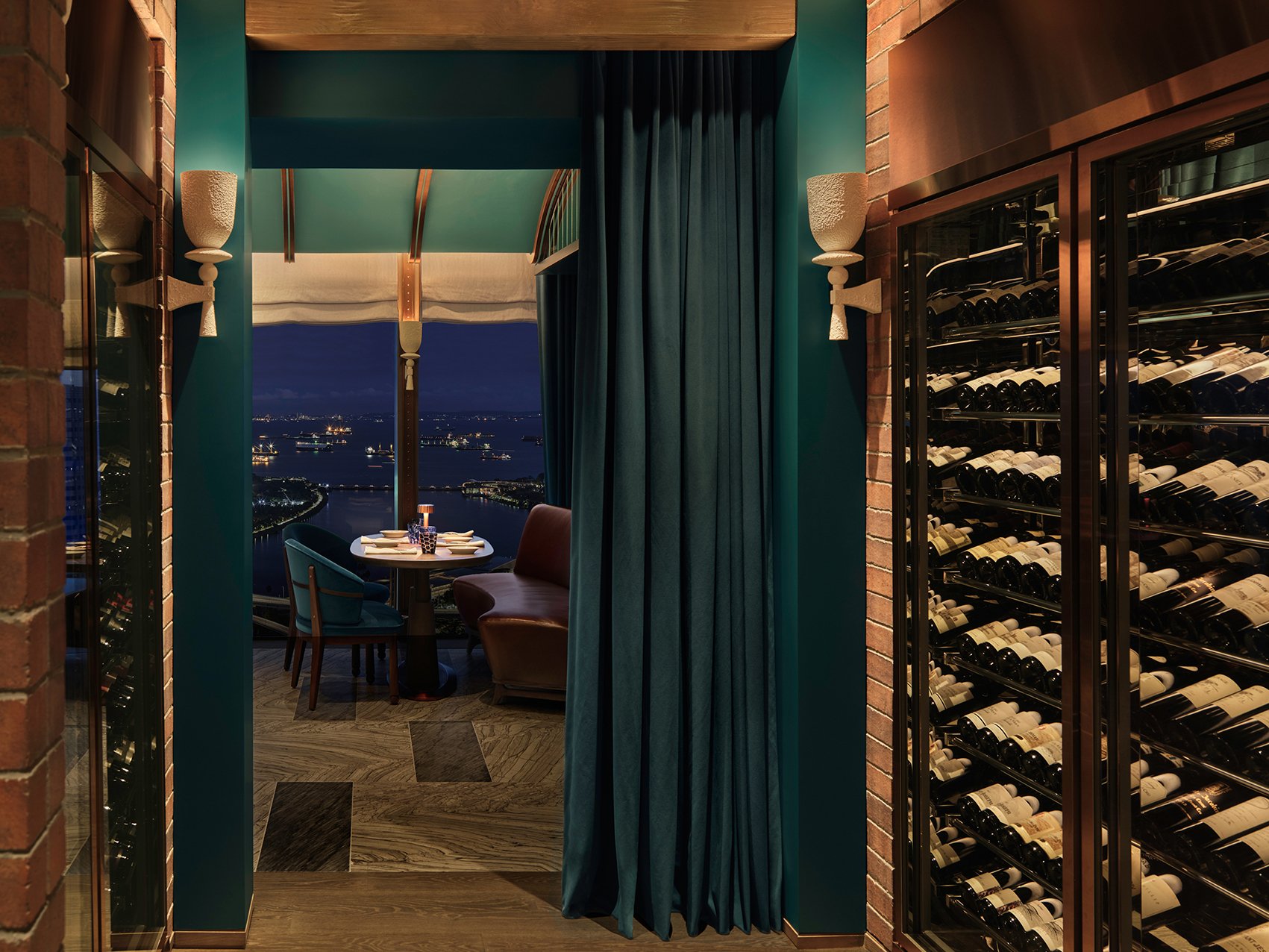
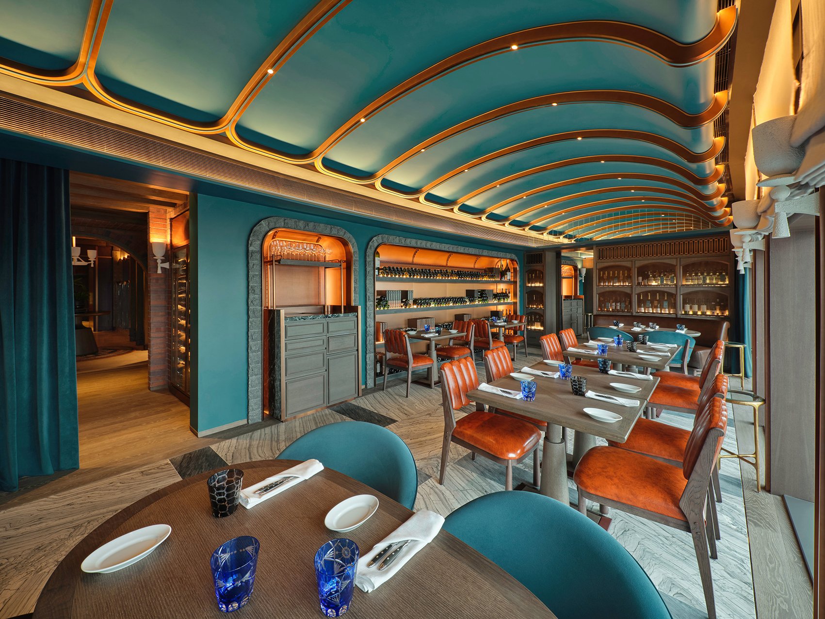
A triple-layered archway made of distressed brick is framed by black ironmongery, reassuringly solid timber doors, and teal blue velvet curtains that pull back to reveal The Cellar’s intimate but perfectly proportioned dining room speckled with low-slung kidney-bean-shaped sofas and ribbed-back chairs. Underfoot are rugged cuts of dark Italian Cadia Grigio marble and light castle-grey sandstone, and bookending the space are timber display cabinets sheathed with wire-meshed doors.
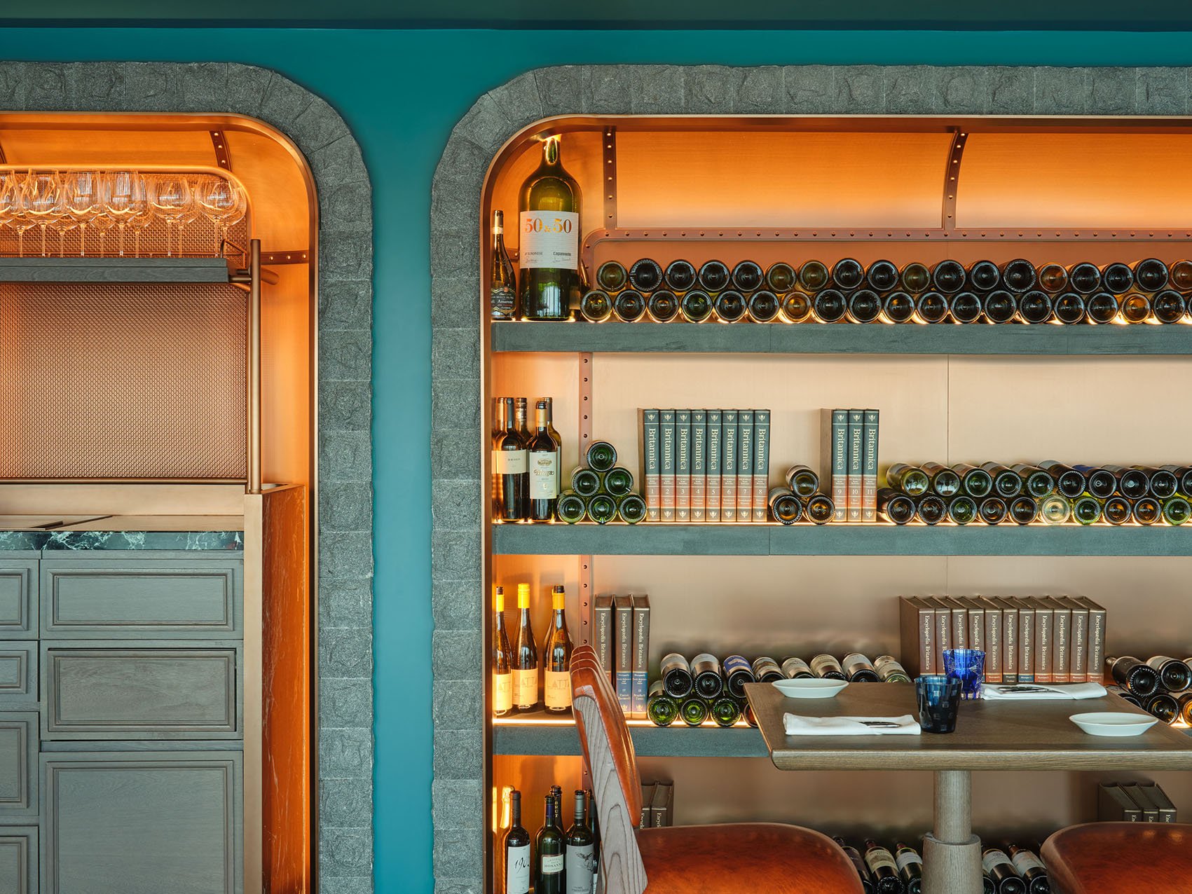
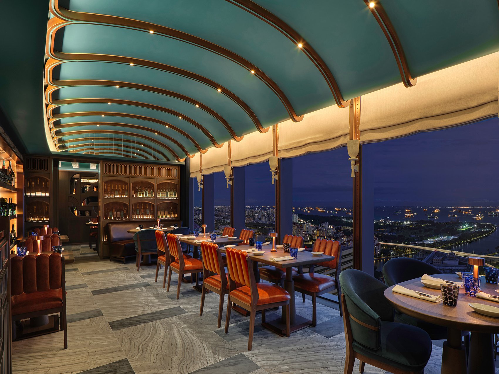
The eye is drawn gently down the length of the room by an arched ceiling in rich hues of deep turquoise embedded with an elegant stretch of oak and copper ribs whose silhouette reminds you, appropriately at this height, of a bird’s outstretched wing, whilst copper shelves, framed by industrial rivets and the soft halo of light reflected through display wine bottles, conspire with copper straps, timber mouldings, and a mirrored clerestory to create the palimpsest of a cellar. Which was the whole point of the design programme - subtlety at work with imagination. As Fu points out, “We were careful to not be thematic, but rather to capture the spirit of the cellar, and which is why the ceilings, for example, are not literal interpretations of a vaulted ceiling. Instead, we have the gentle curvilinear arch of the oak and copper ribs in the main dining room.”
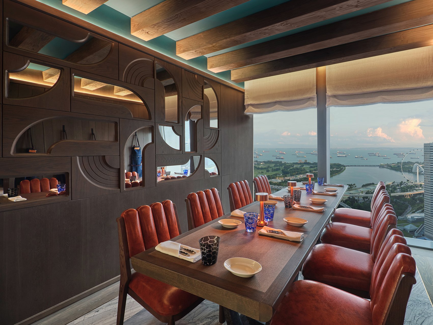
At the far end of the room is the small private dining room – one wall lined by an abstract collage of semi-circled timber insets and mirrors, and the other opening dramatically outwards to an aerial view of IM Pei’s Gateway Towers.
For Fu, The Cellar is an unusual project born out of the need to create more space for an existing restaurant whilst infusing it with a distinct personality that, from a design perspective, also reads holistically. “With The Cellar, I tapped into my own experience and personal memory of real cellars, that feeling of going into an intimate space with a sense of solidity and tactility in the surfaces and materials. And that’s what makes the design a little more intellectual: we’re trying to encapsulate the spirit of a place, but in a way that’s upside down. That’s the difficult part, otherwise, the result will appear contrived.”
For Andaz Singapore’s general manager, Stephan Karl, The Cellar perfectly dovetails with the hotel’s DNA. “Andaz is always about surprises and a touch of whimsy, and André’s design for this addition to 665°F is exactly that. More than ever, diners, today, are looking for a sense of escape, to be more free-spirited, and I think The Cellar is exactly that.”
“We didn’t want to create something that might be regarded as ‘just’ an extension,” adds Fu. “Rather, it would be more of an addition, an aspirational destination in its own right that, nevertheless, was definitely part of 665°F. I think with The Cellar, we’ve managed to carve out a hidden gem.”

