Valencia Tower, 250 City Road: The Regent's Collection
Berkeley Group launches Valencia Tower's Regent's Collection - a luxurious collection of apartments designed and styled by Studio 9.
Located between Old Street and Angel in the London Borough of Islington, 250 City Road is a luxurious new development leaving its mark on the city's skyline. Designed by world-renowned architects Foster + Partners, the project transforms an area just a stone's throw from City Road Basin into an exciting new destination that includes a 190-room hotel, 75,000 sq. ft of commercial space and 1.9 acres of landscaped gardens. At its heart, two towers - Carrara and Valencia, are divided into small communities in the sky. Finished to the highest standards, the luxurious apartments offer new residents customisable specifications, from colour palettes to material finishes. Every apartment has access to an indoor pool, screening room, residents lounge, spa, gym, and terrace. As the development of the project's second tower comes to a close, I meet with the team behind 250 City Road, including Alice Adamczewski, Director of Studio 9 Design, for a tour of the beautiful show apartment, showcasing the available specifications, design and style options for the Regent's Collection.
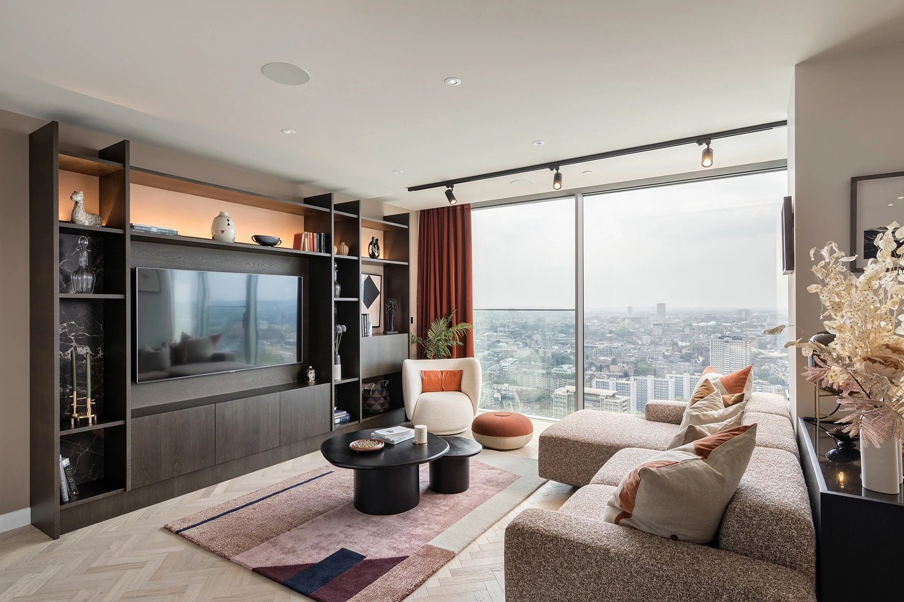
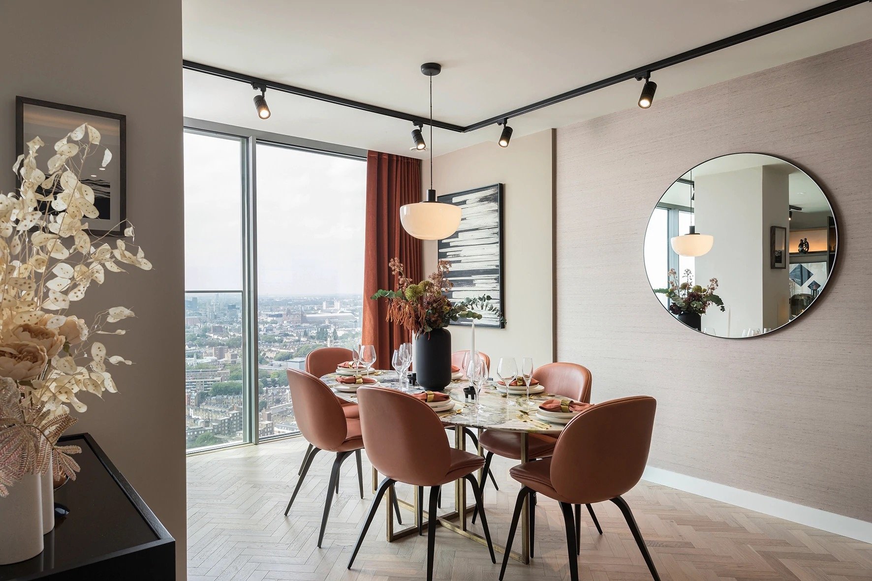
The residences of the Regent's Collection boast breathtaking panoramic views of the city and beyond. The large floor to ceiling windows allows entire walls to become evolving canvases - the light and colouring continually transforming throughout the day across the seasons. The breathtaking views and the surrounding location of City Road have helped influence many of the development's design choices, including Studio 9's decor and styling for the collection's specifications. Alice Adamczewski comments:
“We included heavy terracotta velvet curtains in the living/dining area to echo the elegance of 250 City Road overall. We used the seasons as a creative starting point in this area, but the palette will work all year round; the warm colours are spotlighted in the day as the skyline is bright while at night, it creates a cosy background to the show that is the city lights.”
One thing that immediately stands out in the apartment's decor is the use of colour and texture - something frequently missing from luxurious apartments, particularly with a show space, as developers opt for limited colour palettes with clean and simple surfaces. The pairing of warm autumnal hues with soft textures such as velvet, wool, leather and other natural fibres helps create a homely, inviting and personal persona, complemented by the city that surrounds.
“We chose to use subtle shifts in the tonal palette and a range of textural changes on the surfaces to soften the space without any hard disruption, keeping it harmonious. For example, the Arte wallpaper in the dining area creates a textured backdrop in a natural fibre that softens the wall.”
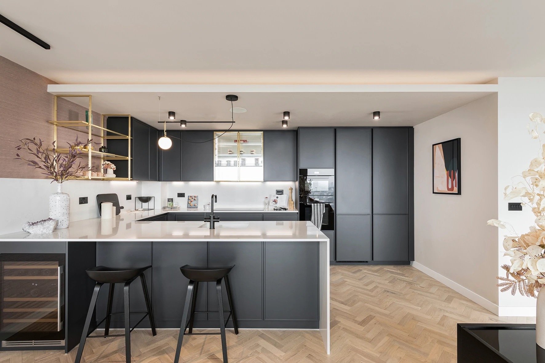
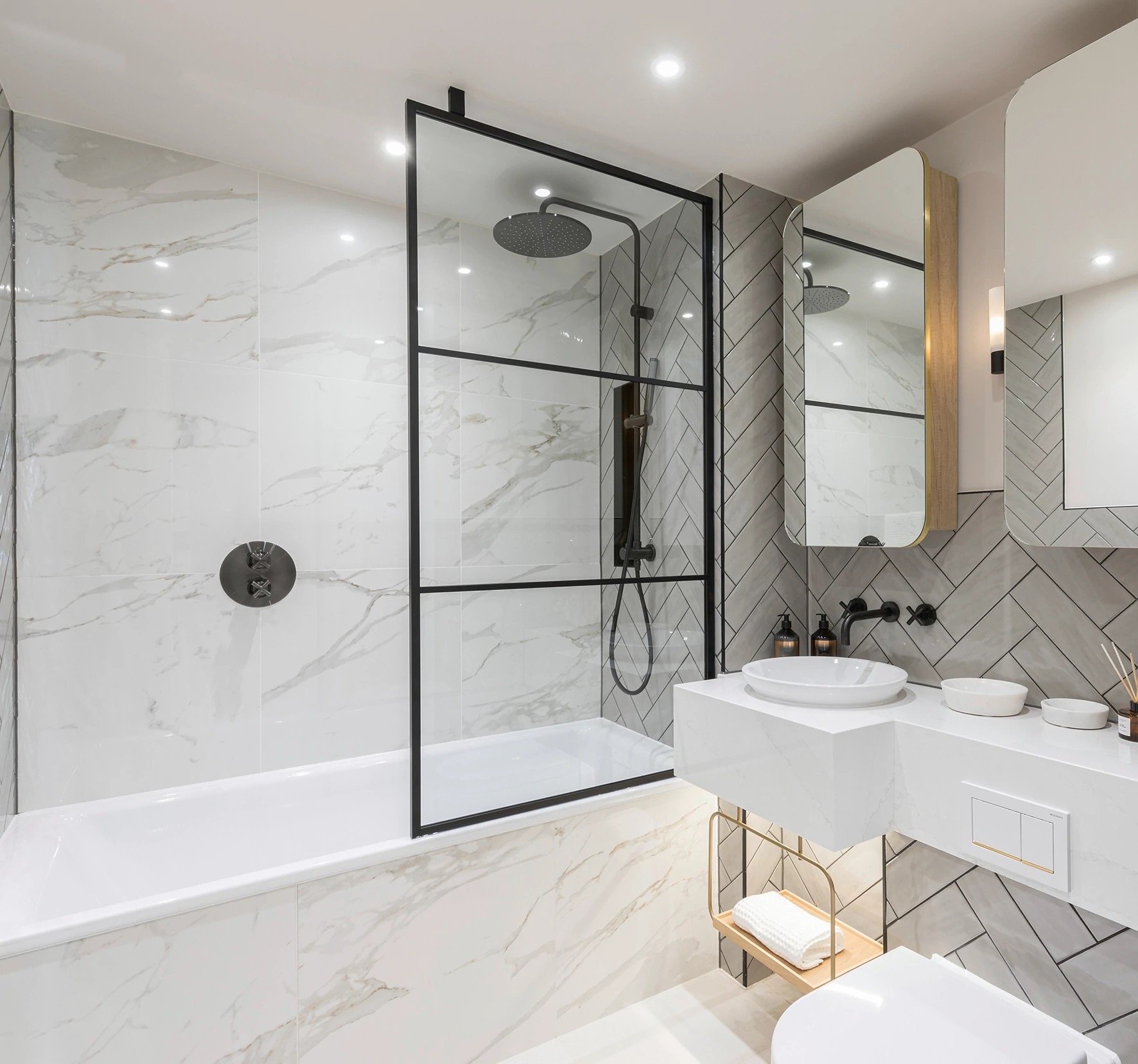
Herringbone, brushed brass and matte black finishes create a unifying style that flows throughout the apartment. An extended colour palette applied through accessories, upholstery and finished complements the staple selection of materials and finishes to create a consistent yet individual look for each space.
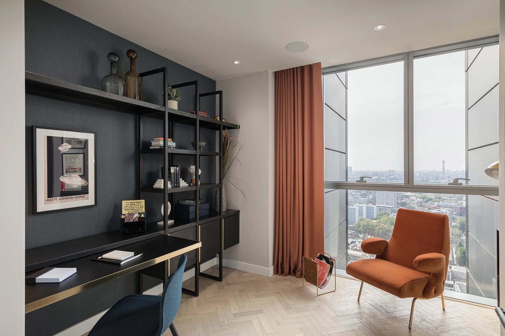
The kitchen pairs glossy white countertops and backsplashes with matte black cabinetry - a defining monochrome style that accentuates the kitchen's clean lines and beautiful form. As the eye moves from the kitchen into the dining area, curvature and circular shapes seen in the dining table, chairs, mirror and accessories help to soften the space, creating an intimate and relaxing environment. The textured pastel pink wallpaper provides a beautiful backdrop and a bridge between the two interior spaces, complimented by a warm terracotta hue that is used in the upholstery and drapery. The living quarters is a beautiful blend of both - running almost the entire length of the wall, a large, dark wood media and display unit is the focus of attention, framing the television and showcasing decorative objects and accessories within the grid of rectangular segments varying. The unit becomes a functional work of art, transforming in presence throughout the day depending on its need - a place to watch a movie in the evening, a bar space to entertain guests or a display cabinet during the day. Two circular coffee tables, an armchair and pouf help break up the straight lines between the unit and the impressive modular sofa, a personal favourite within the space.
“All of the furniture has been curated or specially designed for the space. We wanted to emphasise the luxurious finish of the home with natural tones and materials. The show apartment was dressed in autumn, so we accentuated the warm ambient light with seasonal colour palettes. As buyers, we naturally crave comfort and warmth in our homes – especially during the longer/darker evenings – so a soft, woolly bouclé textured sofa, dressed with layers of cushions, added to that.”
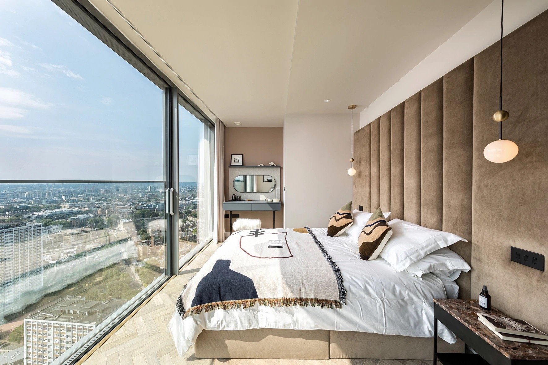
Fully glazed along one side of the room, the central window panel in the master bedroom slides back to open the interior to the great outdoors. Large, golden-brown, velvet upholstered panels create an over-sized headboard, framing the bed and introducing a soft comfort and cosy layering to the room, complemented by the accent cushions and beautiful bed throw. The length of the room utilises the panoramic view to its fullest potential. At one end of the bedroom, making the most of the morning light is a dresser and vanity unit to start the daily routine. At the other end, a chaise lounge/sofa is positioned to allow one to sit back during the day and read a book or relax in the evening, watching the sparkling lights of the city reveal themselves, putting on an impressive show.
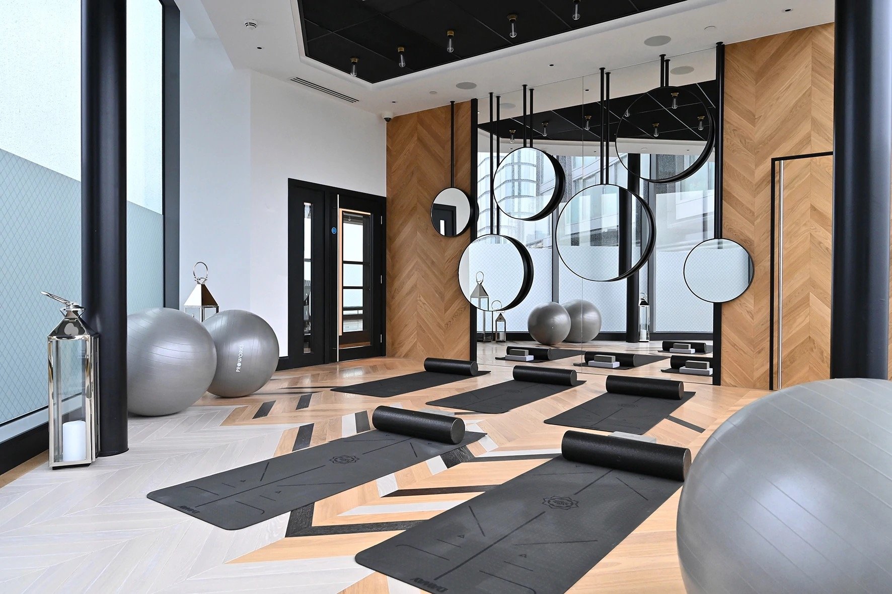
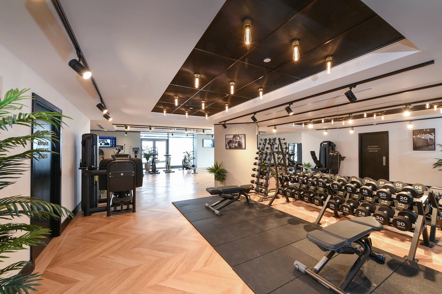
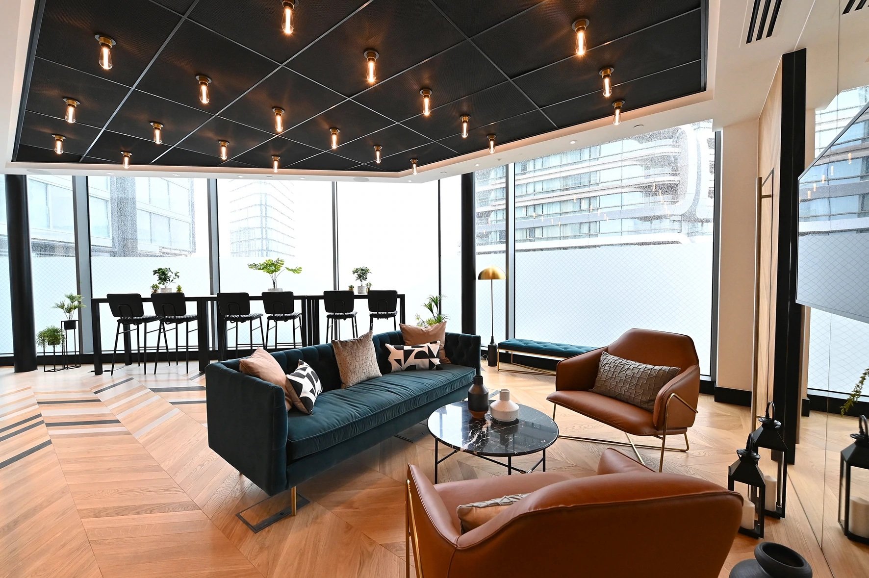
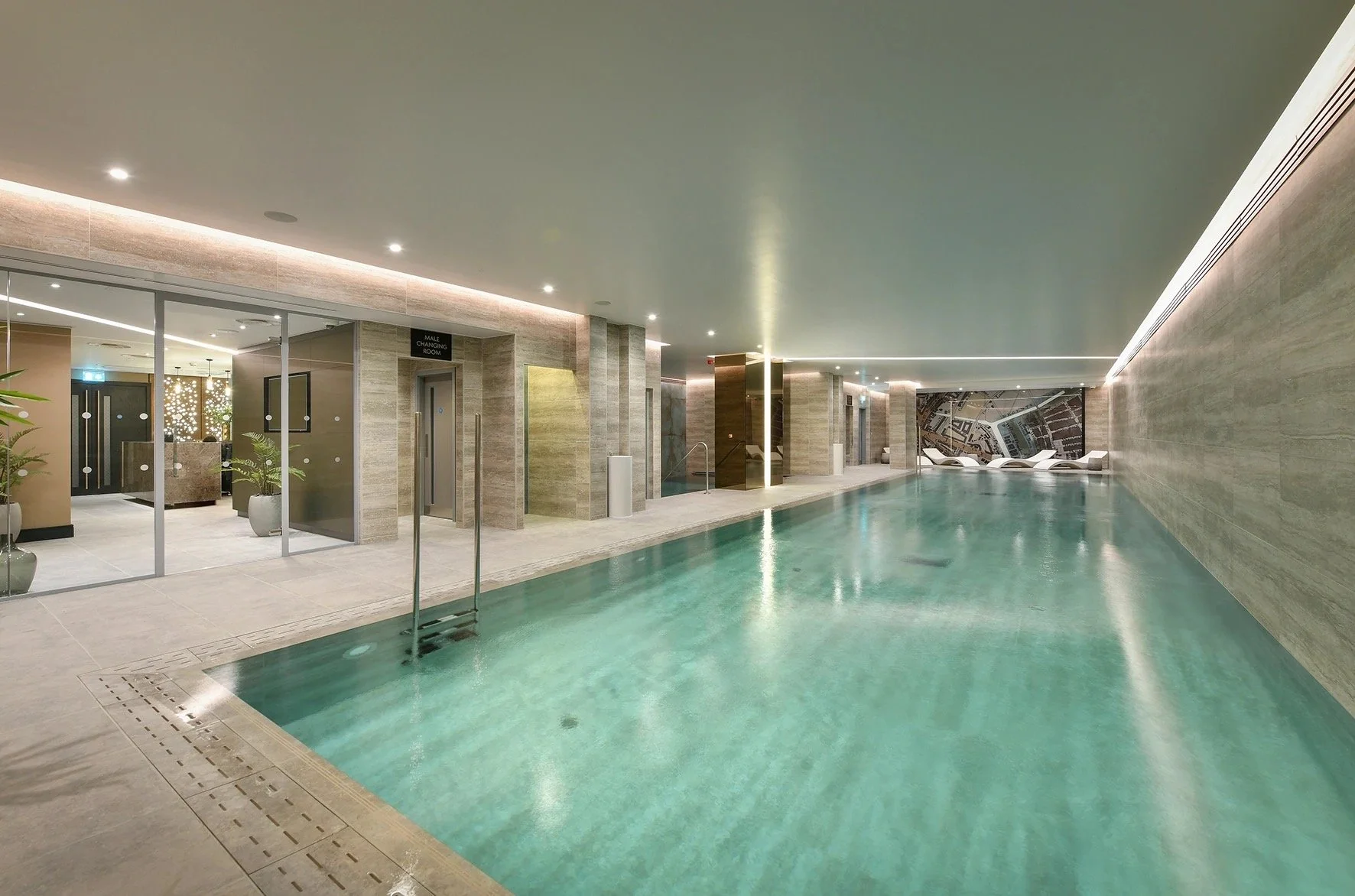
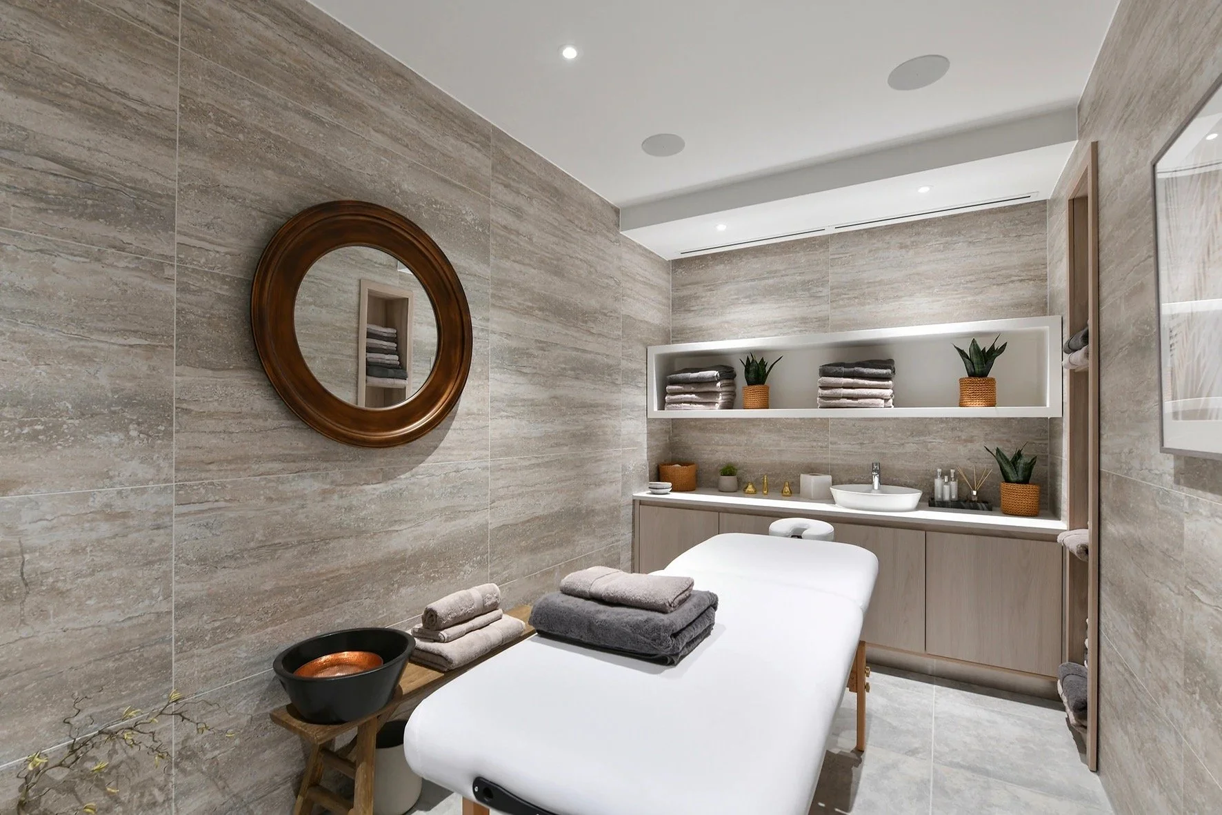
There's more to living at 250 City Road than just the impressive apartments - residents of Carrara and Valencia towers have access to a collection of world-class facilities located within the podium below. Facilities include a screening room, resident's lounge, 20-metre indoor pool, gym, yoga studio, and to unwind, a sauna, steam room and treatment rooms. While these spaces can feel like afterthoughts in many developments, this is not the case with 250 City Road. From the layout to decor and design, the communal spaces visually connect to one another, sharing decorative industrial references such as Buster + Punch filament bulbs, beautiful multi-tonal wooden herringbone flooring and wonderful photography and artwork that references the building's surroundings. These destinations are really an extension of the home and the way they have been designed blurs that boundary, creating places to connect and socialise with neighbours, focus on health and wellbeing, set up a business meeting or unwind after a productive day.
250 City Road hasn't just made its mark on the skyline, it has made an impression on the city, forming part of a greater cluster of developments that is reshaping the way that we live, work and enjoy city living. While the emphasis of many luxury developments lies within the apartments themselves, it is refreshing to see a developer that prioritises so much time and effort on the facilities and their uses, incorporating them into the overall design, making them feel like an extension of the home. The flow of design between residence, commercial and facility spaces ensures comfort, wellbeing and more importantly, socialising. Luxury is no longer a material thing, it is an experience, it is a lifestyle. I am thrilled to see Berkley Group set the standard.

