Dimorestudio: Aesop Milan
Dimorestudio creates an incredibly beautiful store concept for skincare brand Aesop, taking inspiration from early 20th century villas in the surrounding area.
Famed for their iconic and unique store designs, often inspired by the local surroundings, Aesop has worked together with Dimorestudio to create an incredibly beautiful store concept that takes inspiration from early 20th century villas. Recreating old-style furnishings and decoration whilst applying new materials and finishes has created a striking style, now heavily associated with the brand's identity.
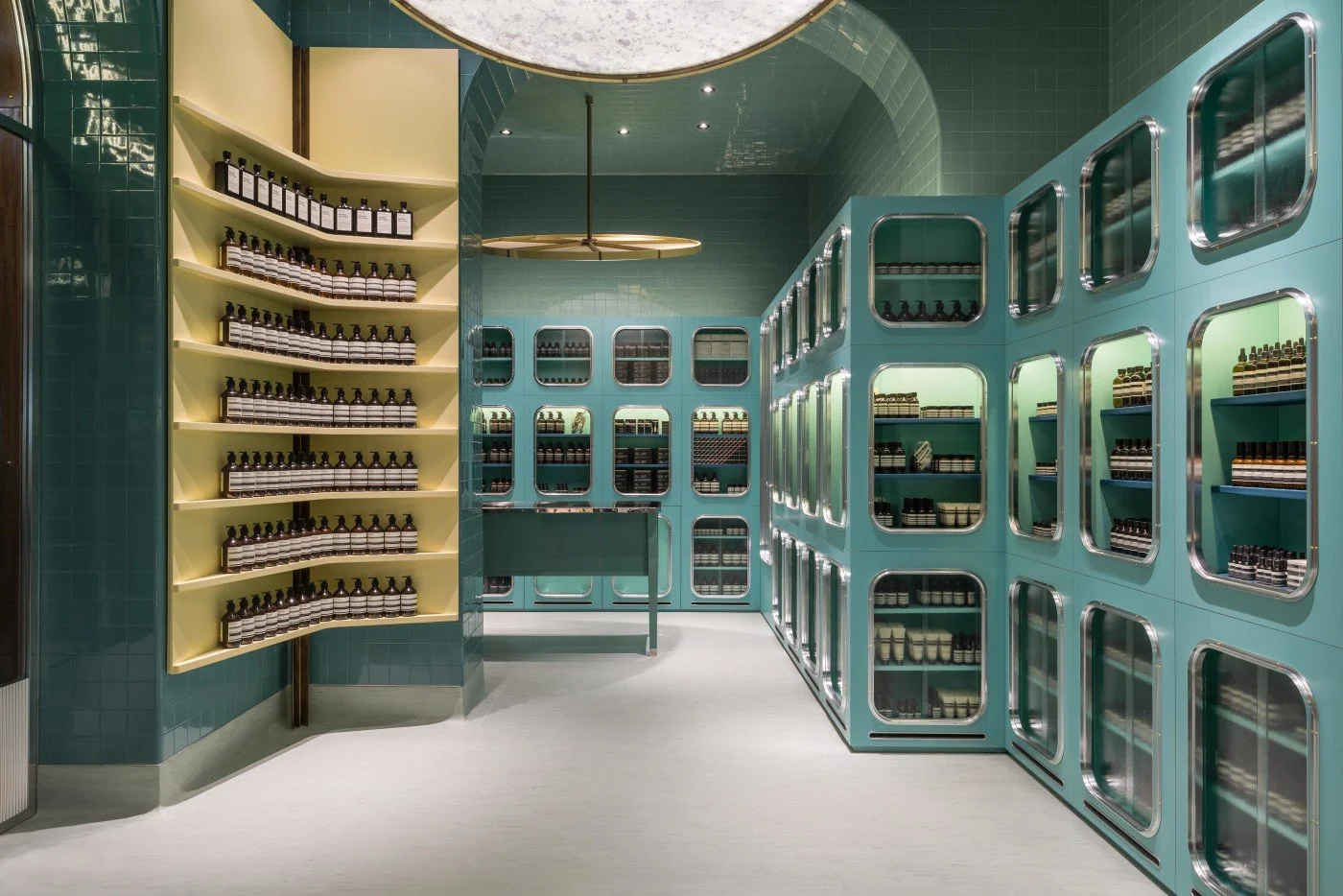
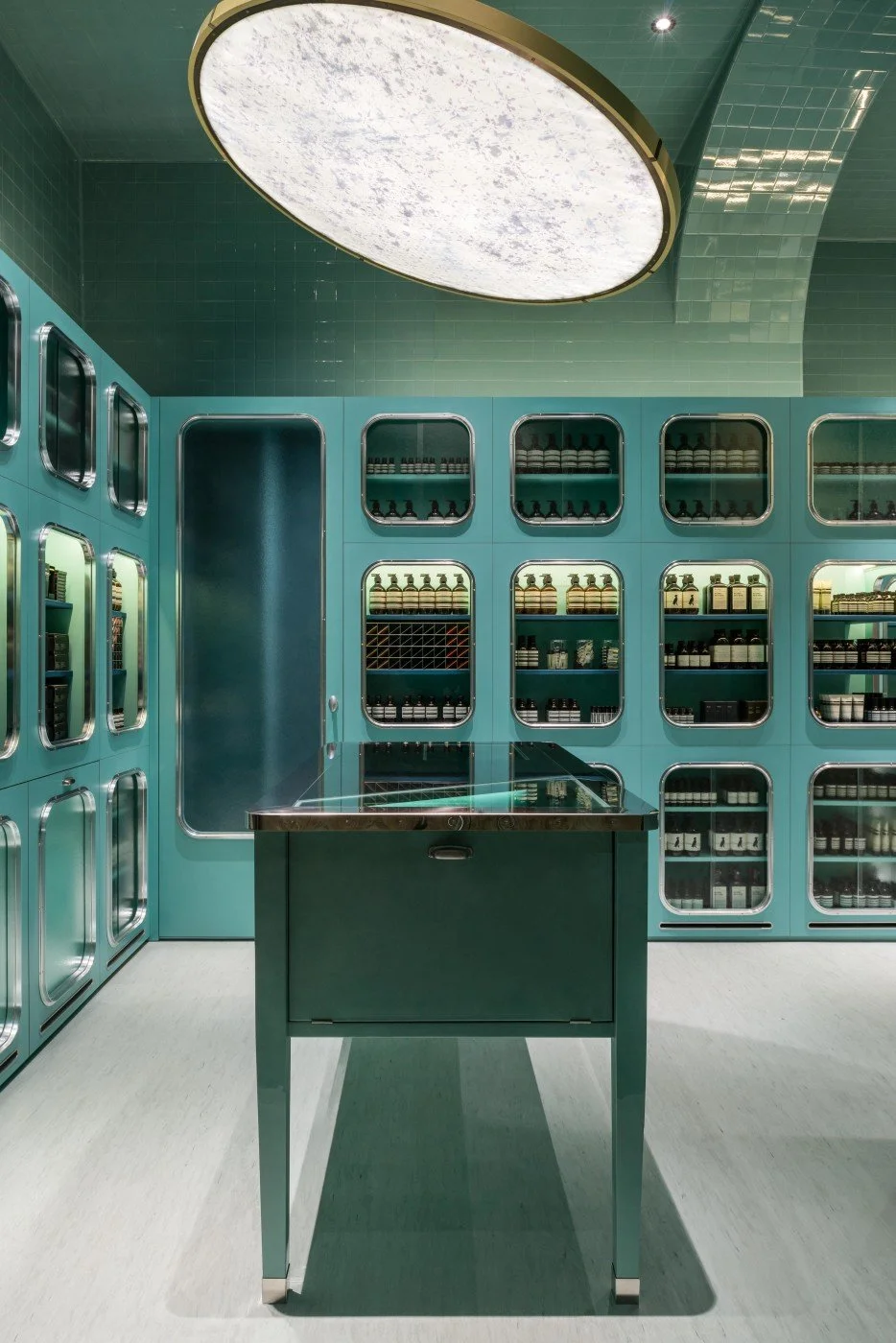
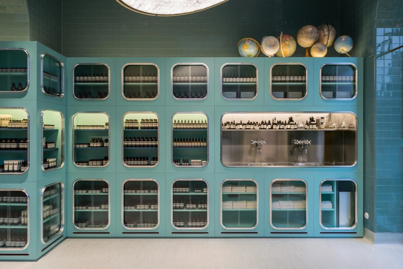
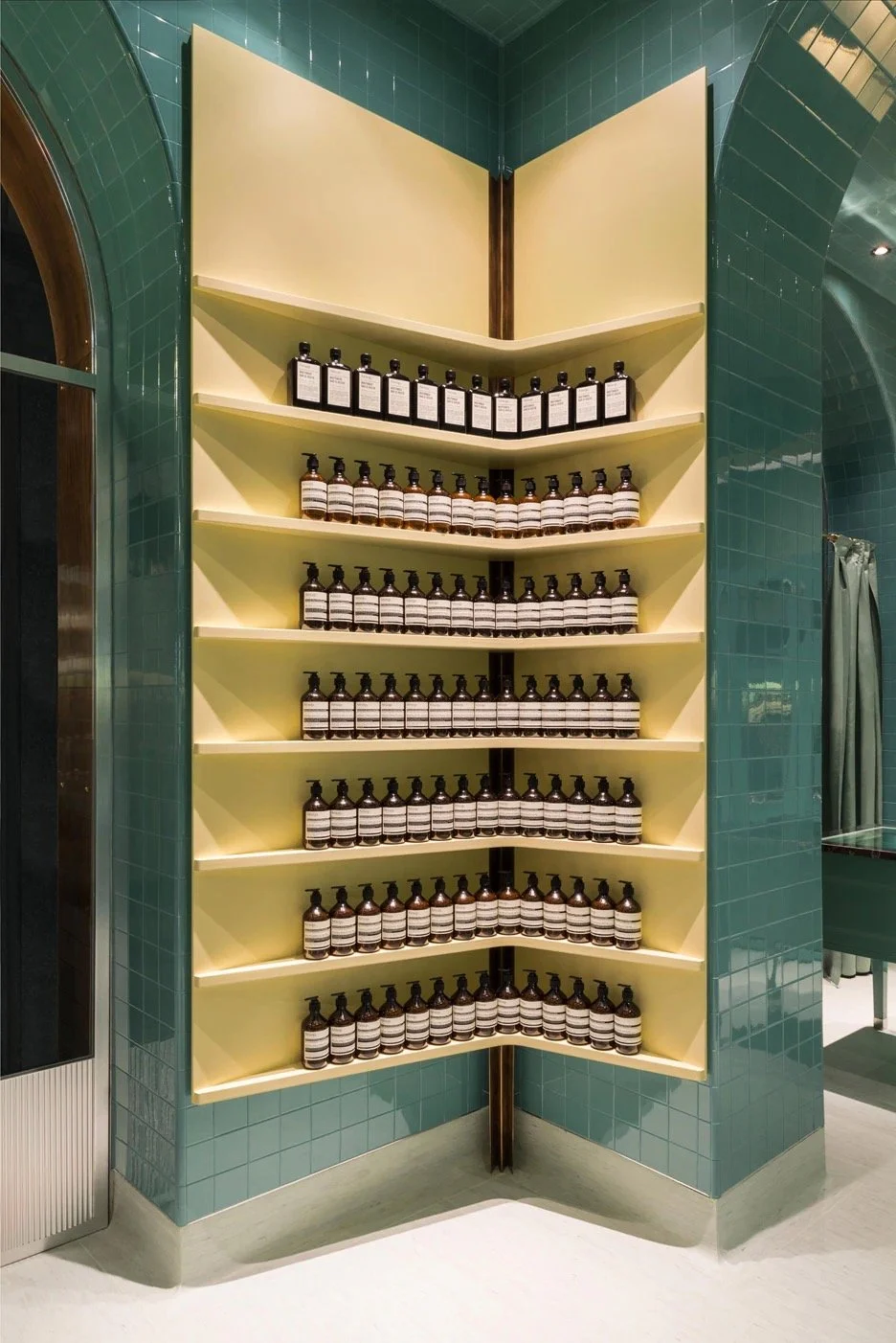
Glossy teal subway tiles cover the walls, ceiling and arches, the colour adding warmth to an almost clinical finish. The surfaces have been softened with the use of muted colours, faded yellow for the feature corner shelving and powdered pink on the seating upholstery. These subtle tones are echoed in small details such as the vintage globes, display packaging and metal fixtures and fittings throughout the store.

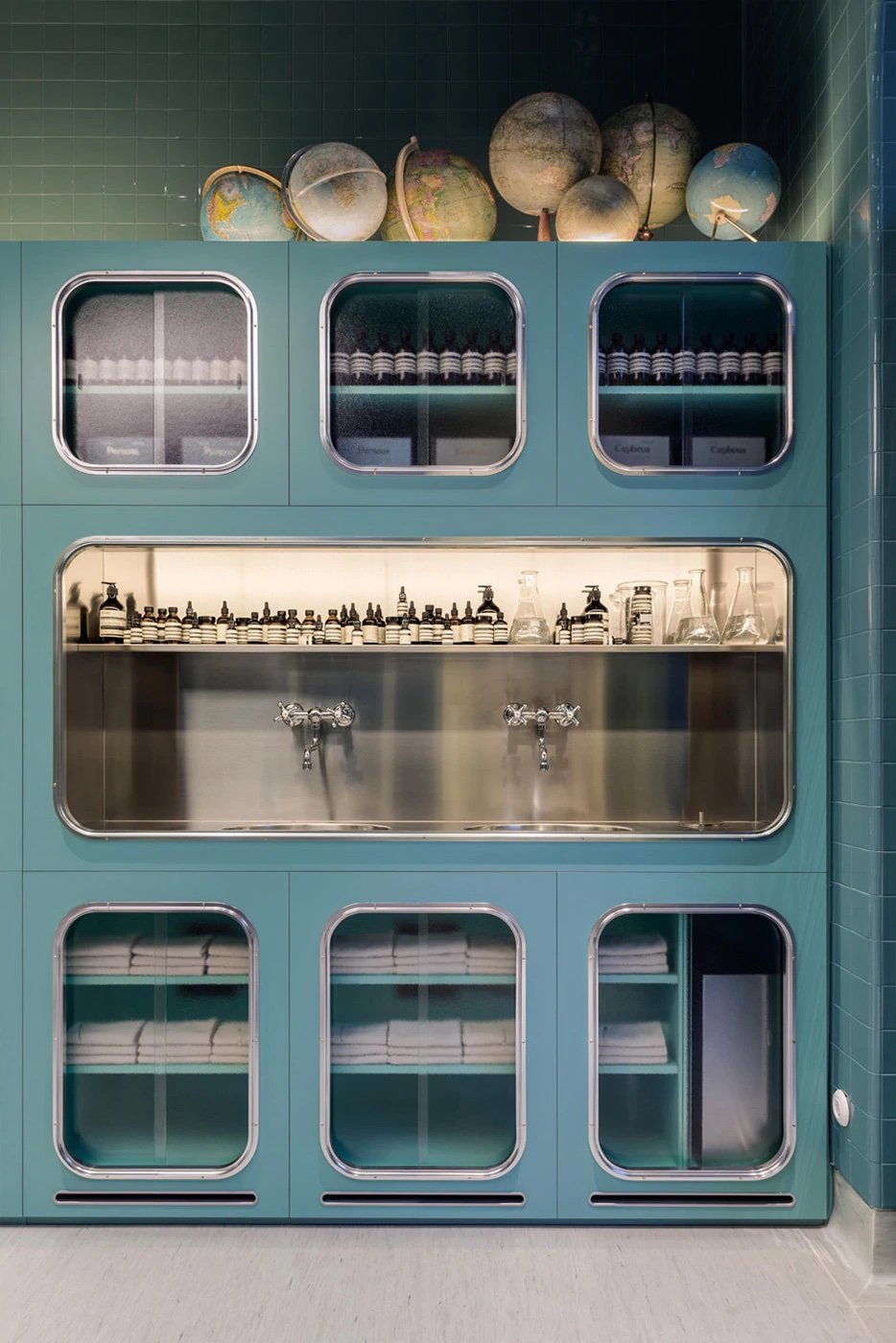
Display cabinets replicate the same green of the tiles, almost stepping back and merging into their surroundings. Aesop products are neatly lined within, each window a view into a particular product. Details such as the rounded window frames of the units and sliding glass doors all reference back to early 20th century, complemented by the light grey linoleum flooring, subtly curving upwards as it reaches the wall.
Aesop has achieved the difficult task of having an instantly recognisable brand image without constraining itself to a singular store concept. With a growing portfolio of over one hundred stores, it is great to see individual concepts evolve, creating designs that are perfectly suited to their locations. As the brand has mentioned, it is within its criteria to work architecturally with what is already there and to interweave the Aesop brand into the fabric of the street rather than impose what they are doing.