TV Set Interior Design: NBC's Will & Grace
As the much-loved sitcom, Will & Grace returns to our screens after an eleven-year absence, discover the interior design and styling that goes on behind the 'scenes' to create these impressive sets.
When it comes to interior design, it can be hard to envisage anything outside of the realms of residential and hospitality. These are familiar places to us that often require an interior designer to complete a project. After covering everything from Aviation design to public swimming pools and sauna interiors, I was reminded of another area of design that has an altogether different requirement; setting the scene whilst not stealing the attention.
Requirements of TV set interior design.
Will & Grace hit headlines across the globe after NBC announced the sitcom was to return from an eleven-year absence. Whilst much of the attention was focused on the fabulous foursome that graced our television screens for eight years, it was the release of the set design images and preview that exposed the level of detail and unique requirements needed for television set design. When creating an interior for the home, it is the functionality, durability and beauty that are top priorities for designers. As a television set is a temporary space within a much larger room, a designer only has to create the illusion of a real space whilst priorities focus on the filming requirements such as set deconstruction between seasons, faux surfaces, set lighting and camera location. Considerations also have to be taken into account about the fictional characters that use these spaces, everything from their personalities and style down to their bank accounts, jobs and history.
Set design secrets
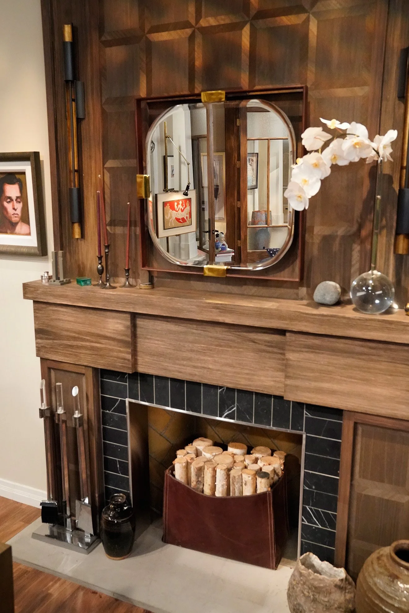
One special adaption for the set came to light in an interview with Eric McCormack (Will Truman) and Sean Hayes (Jack McFarland). They revealed that the previous and new fireplaces in the main apartment have been adapted to allow the mirror space to fold down and allow a camera to move into its place to film the close-up sofa shots.
Each of the main sets is updated over time to reflect the styles and trends in real-time. Throughout the series, changes can be seen in the coffee table, chairs and artwork of the main apartment but they can also be most noticeably seen in the fabric patterns and curtains displayed in Grace's office, representing on-trend styles to match the knowledge of an ever-developing character.
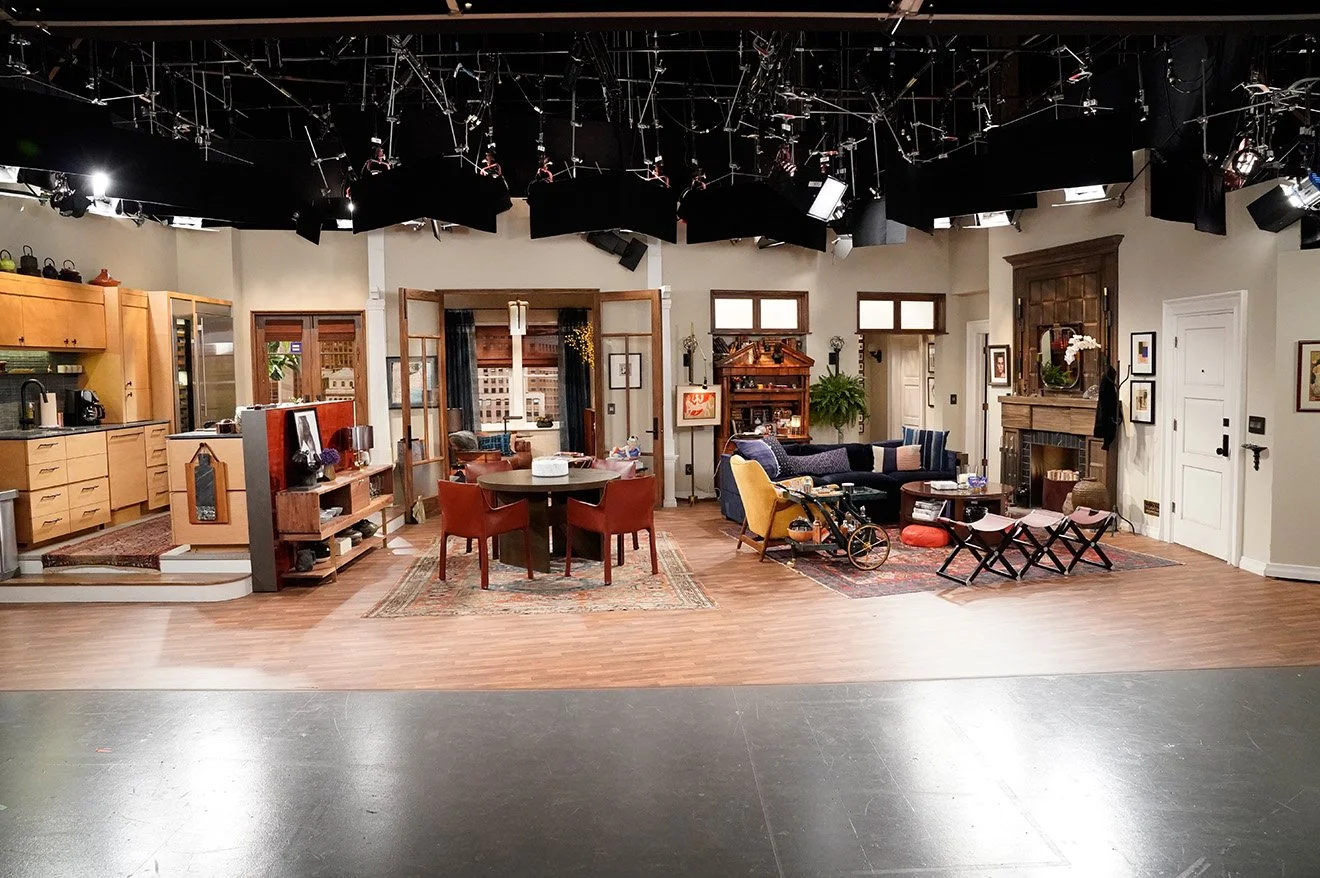
The sitcom is filmed in front of a live studio audience each week, meaning the entire front of the set has to be left open, not only for the cameras and film crew to have access but for the audience to respond to the action and comedy. This adds further challenges to an already demanding task with the designer having to consider the decoration and layout of a full space even with one side missing.
Will & Grace set design review
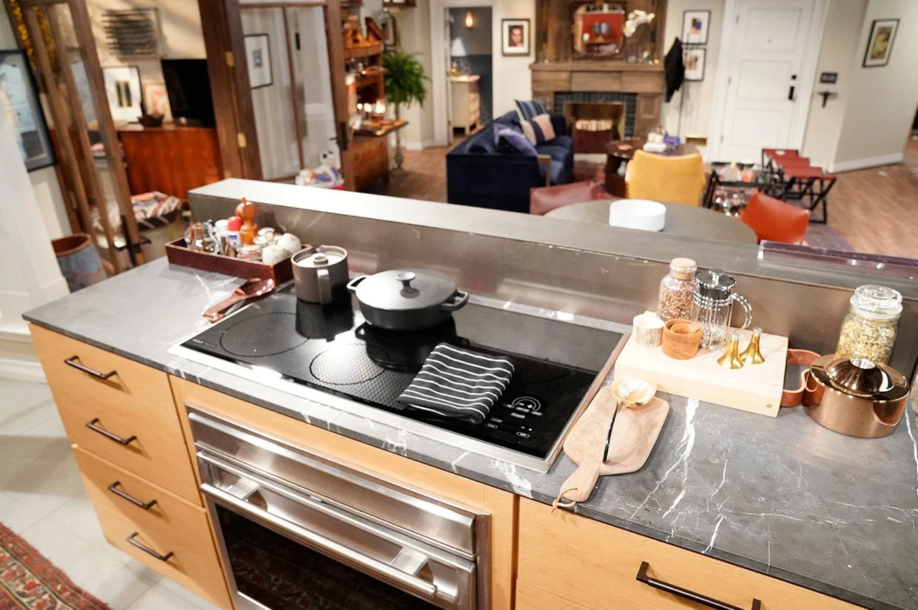
No expense has been spared on tweaking the set to give it a 2017 style update. As the characters have evolved and become more successful, the interior design has been changed to match this success including the introduction of designer pieces such as a Holly Hunt sofa and Hermés Pippa bench that currently retails at over £15,000. Other updates include the new Rose Tarlow design coffee table in the living space and four Cassina's Cab chairs that surround the dining table. Any avid fan of the show will also notice the introduction of a much taller wine fridge in the kitchen which has also been upgraded with the latest technologies including a SubZero refrigerator.
The hallway has had a dramatic overhaul, removing the light coloured wallpaper and replacing it with paint in a deep blue hue. New artworks adorn the walls keeping with the new contemporary style, each being sourced from local New York galleries. The flooring sees the introduction of a new decorative pattern and space directly next to Jack's apartment, once used for Jack's coffee shop venture now sees a long upholstered bench in its place. Even finer details such as the door numbering have been changed to display a more contemporary font in dark metal.
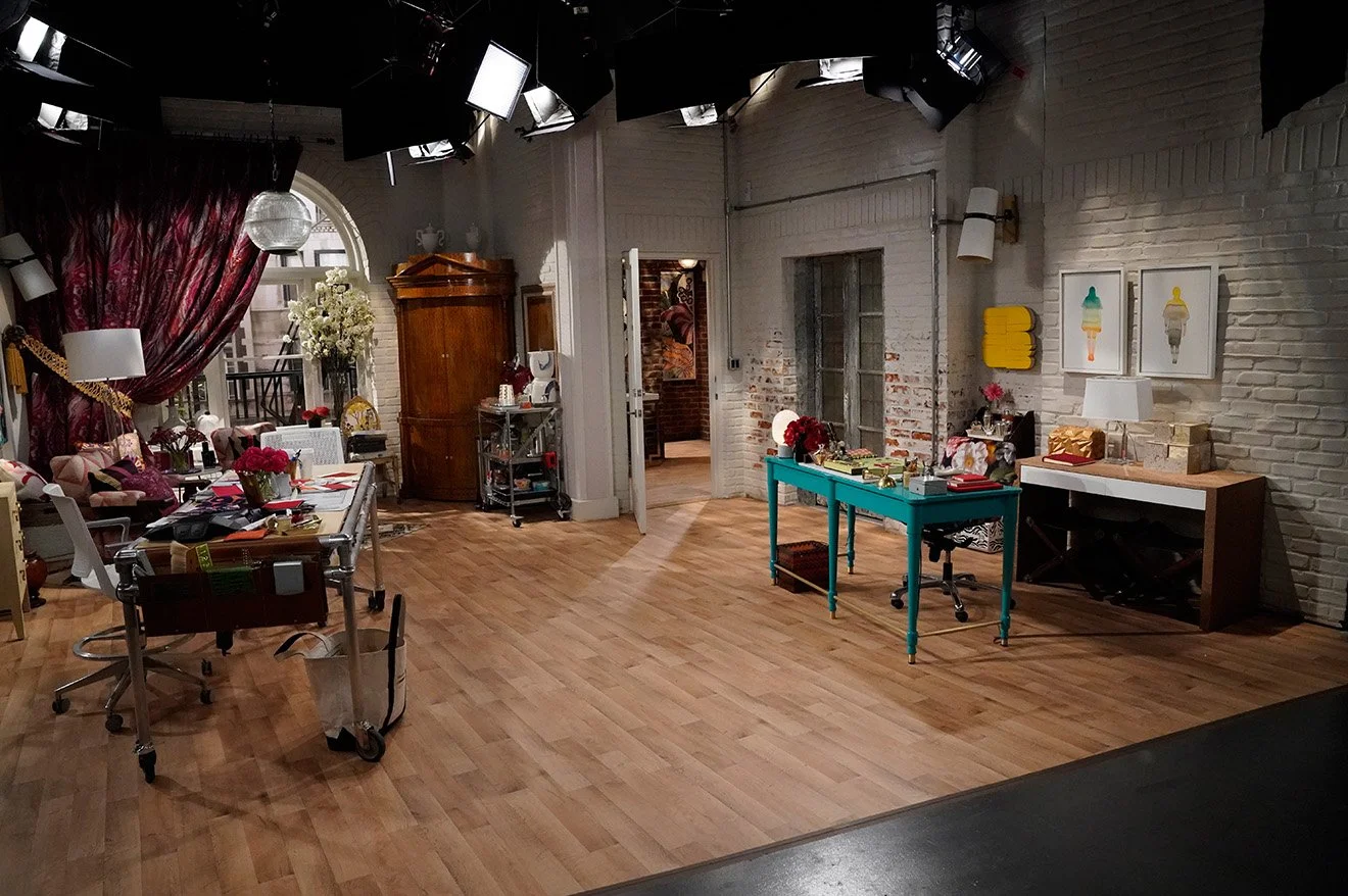
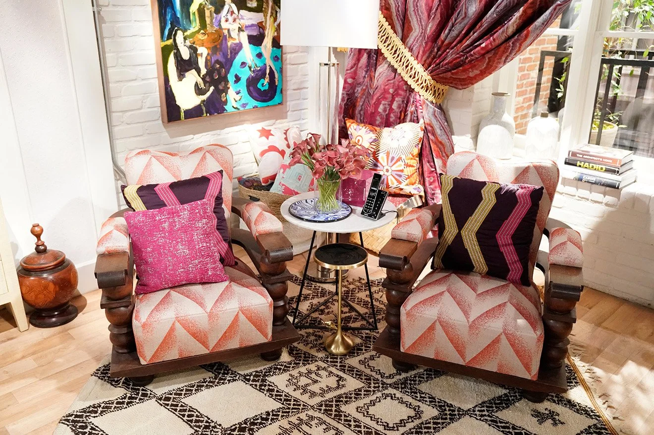
One of the biggest changes to the relaunch can be seen on the set of Grace Adler Designs. As the character of Grace has evolved to become a huge success within the industry, the decoration and dressing of the studio have replicated this. Almost all of the furniture has been replaced and the studio has been extended into 'the office next door', doubling the size of the studio which has allowed for more desks, a lounge area and a second entrance to the property. The one piece that has and most likely will always stay the same is the working table in the centre of the room, the place where designs come to life. The chic design has been inspired by Grace's personality and design style, using bold colours, lots of texture and contrasting pattern prints.
Photos: Chris Haston/NBC
Those with a great eye for detail may also notice that the service lift doors have also been changed from a wooden style latticework to a metal and glass set of doors. These new doors were salvaged from a property in upstate New York in real life before being restored for the set.
Whilst the specifications for each set will change depending on each project and the popularity of a show, it is wonderful to see the intricate levels of details included within this magnificent set design. A work of art that will go unnoticed by the majority of its audience (minus a few details) is a sign of a job well done. It emphasises the lives and personalities of the characters portrayed within the walls and becomes the ultimate symbol and trademark of a successful show. Whilst our attention may be focused on a character's every move, we would most definitely notice if their beautiful surroundings were suddenly removed.

