AB Concept Studio, Victoria Dockside
AB Concept designs the interiors for their new Victoria Dockside office in Hong Kong, exhibiting the personality and passion behind the brand.
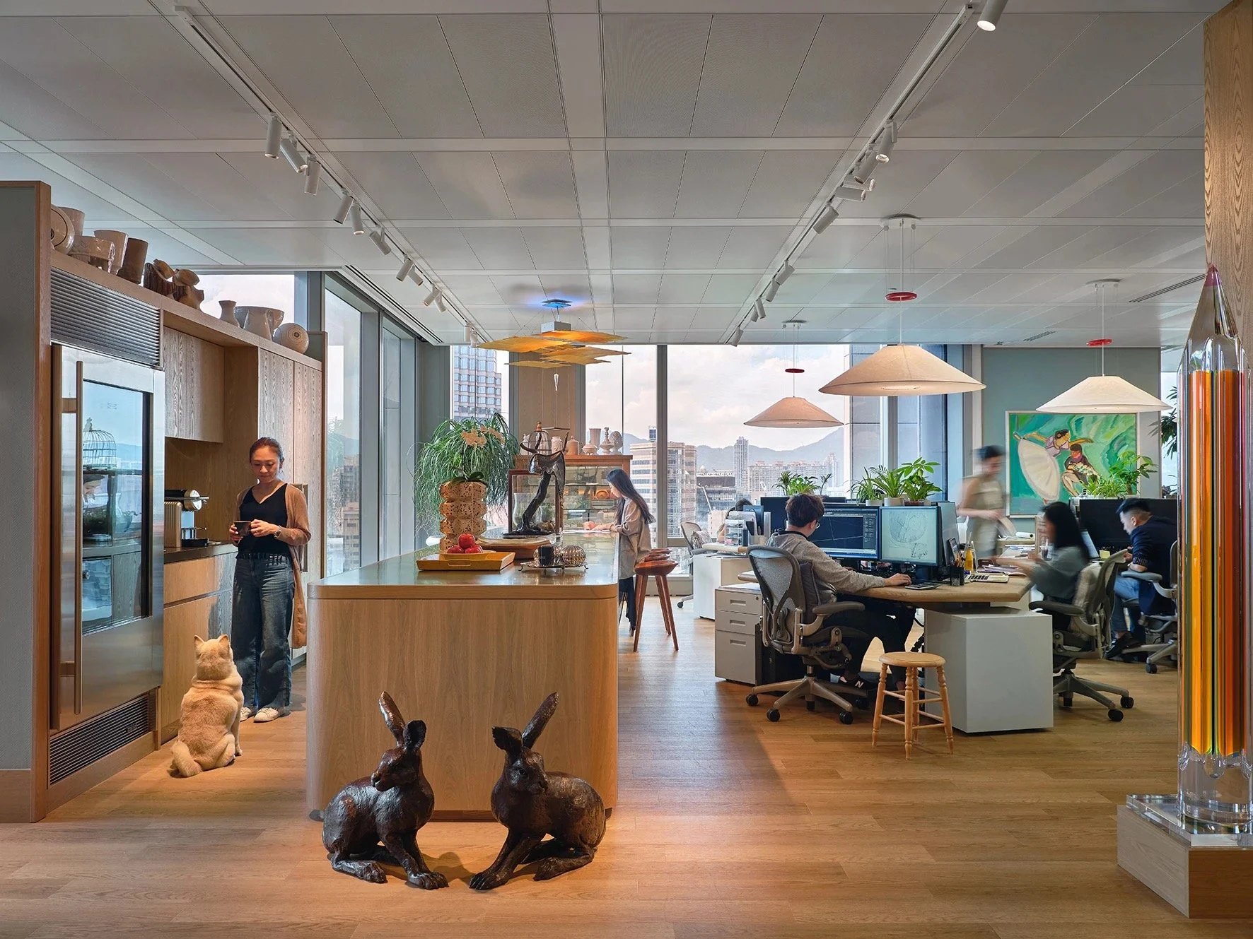
International interior design and architecture studio AB Concept designed the interiors for their new office as they move from Causeway Bay to Victoria Dockside in Hong Kong. The studio opted to go against the familiar white walls and clinical feel of standard office spaces, creating an inspiring, characterful and colourful office space for their staff and clients. Walking into the studio, there is a familiarity, a homeliness and a cheeky fun side that is often missing from office and business destinations. The new studio contains many objects and furniture pieces from Ed and Terence's own growing personal collection, sourced from numerous locations from all corners of the world, creating an eclectic design that creates conversation and drives creativity.
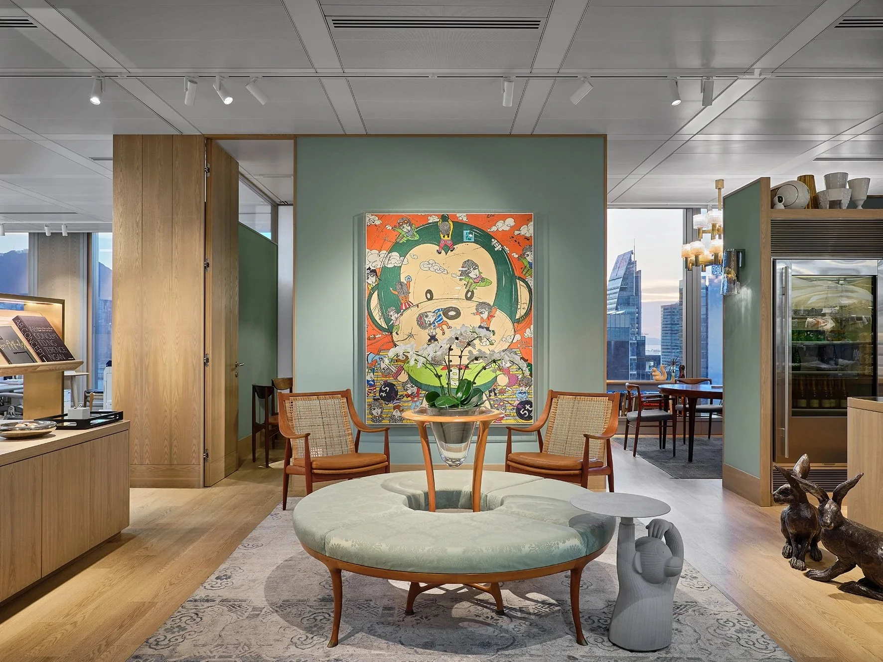
Eagle-eyed visitors may notice a recurring theme - several monkeys feature around the office, within the artworks and even becoming part of the furniture; a reference to Ed Ng's birth year in the Chinese zodiac. There is no traditional reception, in its place to greet guests is a sideboard filled with magazines, teak lounge chairs by Peter Hvidt and Orla Molgaard-Nielsen, a circular chair by Roberto Lazzeroni, and a cheeky concrete monkey side table by Jaime Hayon to wait on guests and staff for informal meetings. Framing the interior is a large piece of monkey artwork by Yim Tae-kyu, introducing a colour palette of green and orange hues.
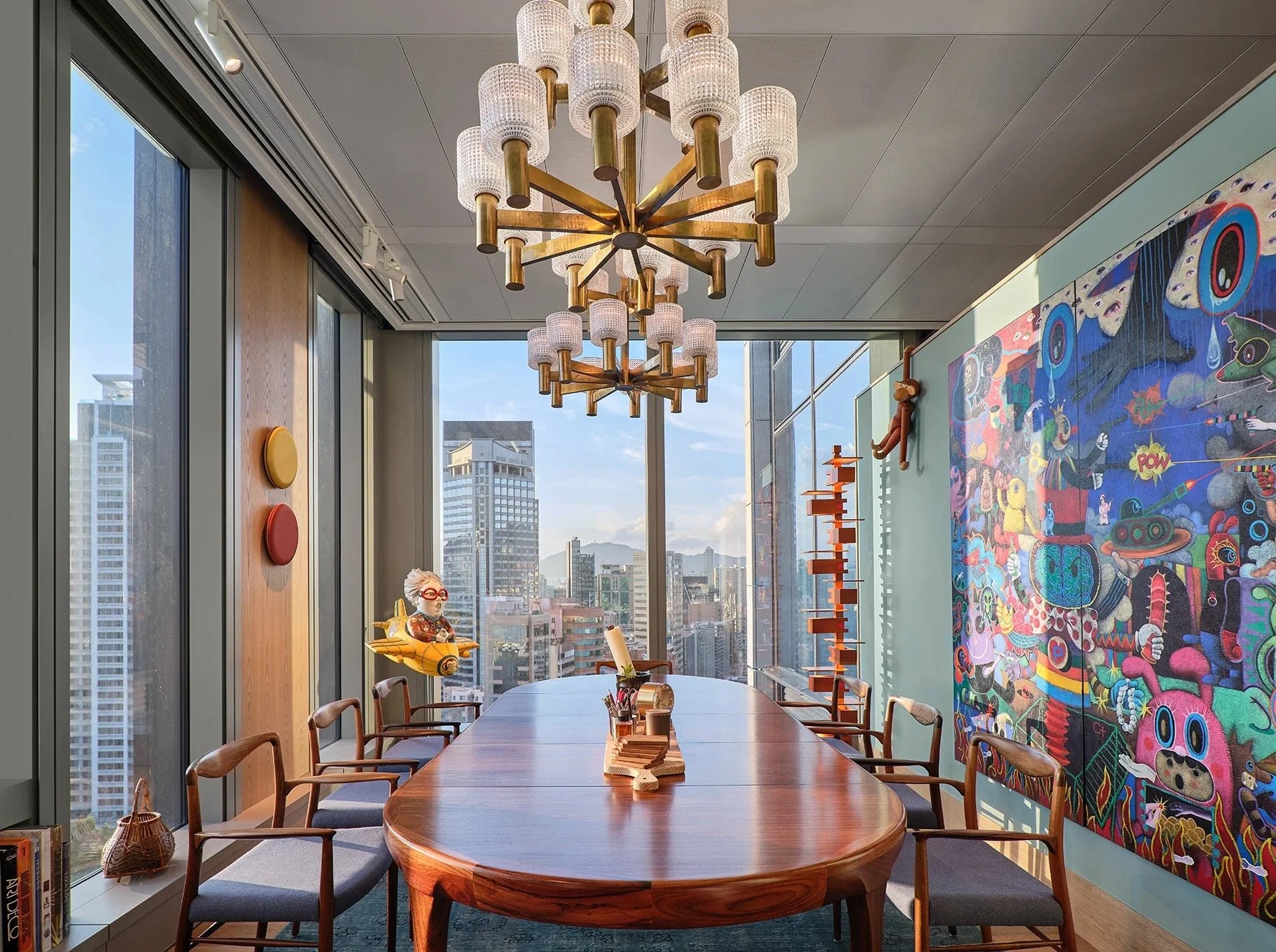
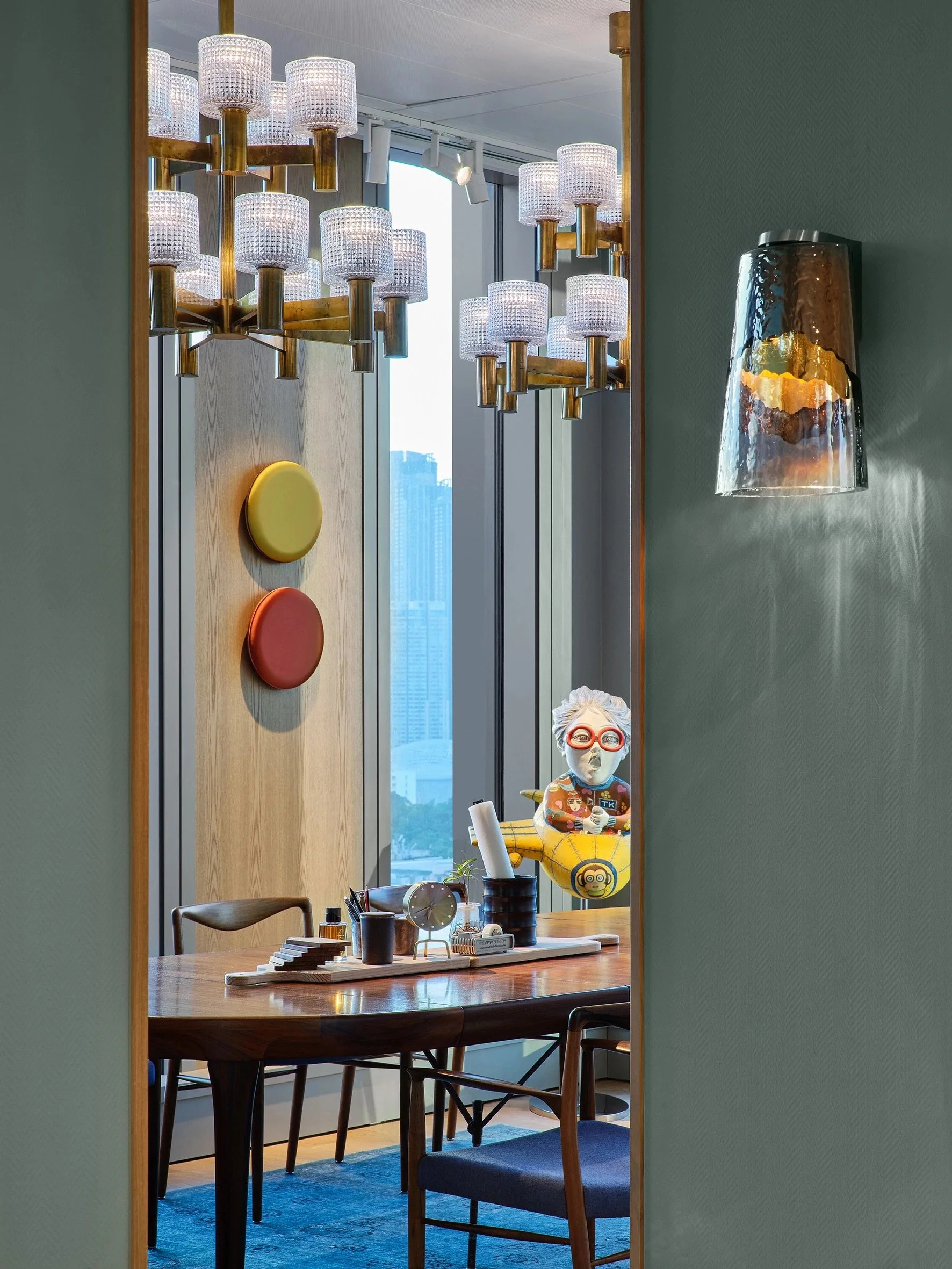
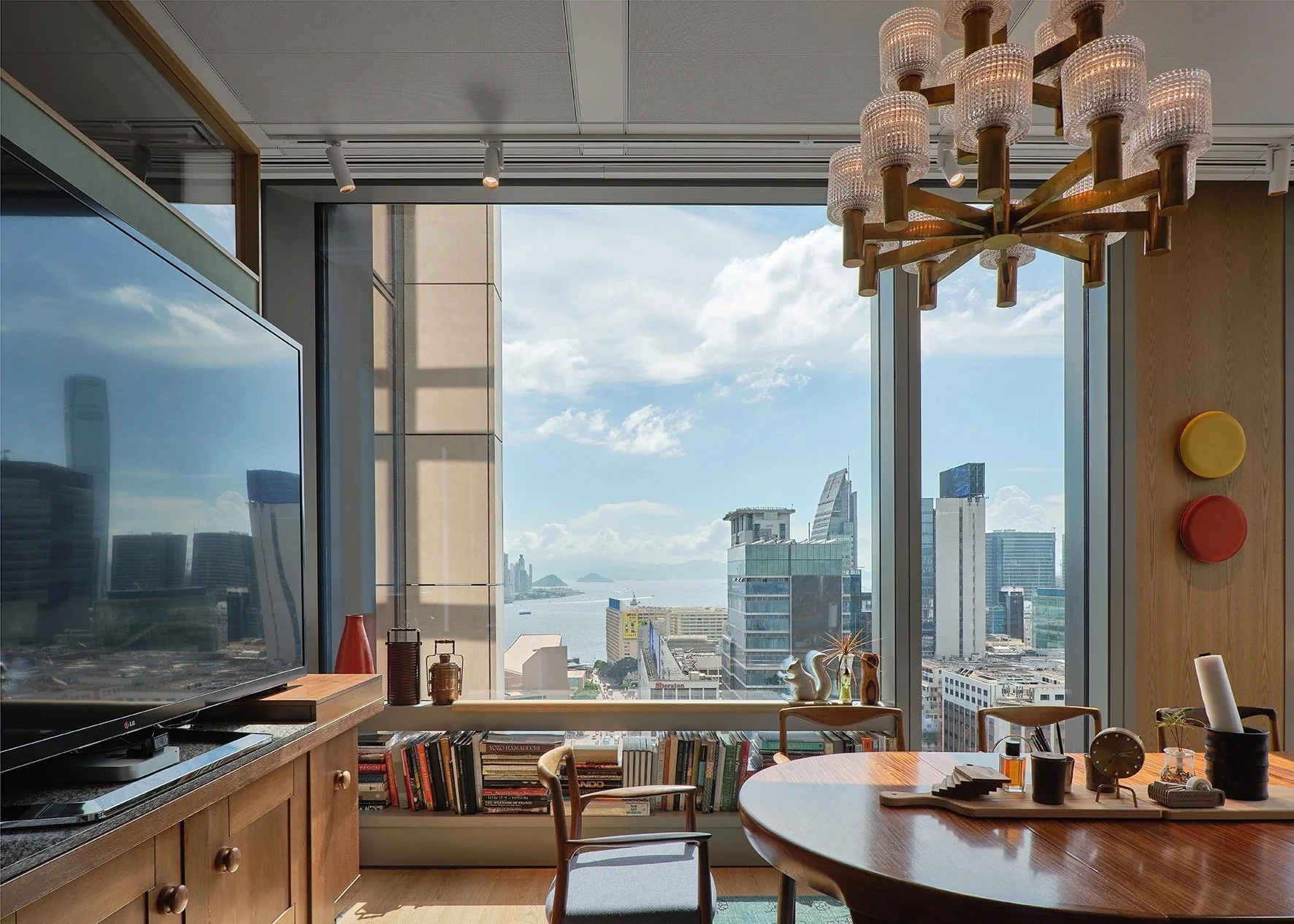
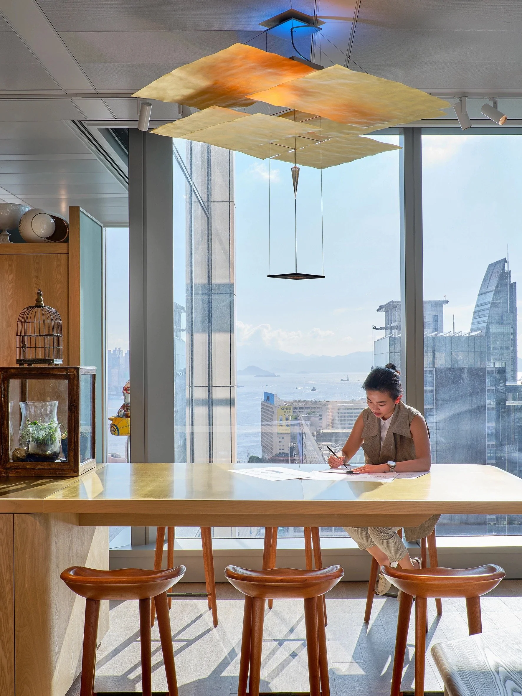
The 'dining area', or conference room, features a beautiful 8-seat table boasting breath-taking views of the dockside harbour through the floor-to-ceiling windows. Two chandeliers hang above the table, lighting originally from an opera house in Sweden, while a colourful painting by a Filipino artist is given a new home on the sidewall, sourced from the gallery at the W Bali; just a few pieces with wonderful back stories given new life and meaning within the studio. The only space with a door is a small sitting room used for interviews and meetings, where framed photos taken by Ed and Terence and project sketches hang around a vintage, chipped porcelain mirror, bought in a Sotheby's auction. The kitchen offers an extended eating area, complete with a coffee machine, microwave, fridge and wine cellar, along with decorative accessories and touches that create a home away from home.
The partners also designed custom hexagonal desks for the staff to encourage collaboration and openness. The screens are arranged in triangle forms with potted plants at the centre, while Ingo Maurer lamps are made of Japanese paper and iron, chosen for their homely character.
Rather than allocating vast spaces for the materials sample library, the designers took a selective approach, instead, placing textures around the office to give clients a vision in context and allowing the interior to become more intimately involved within the design process.
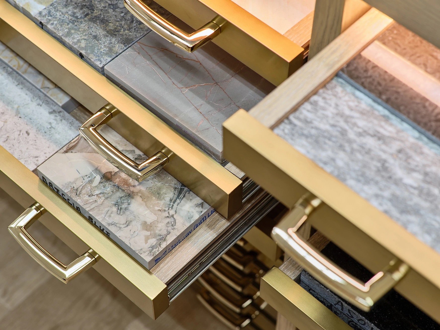
The materials room itself resembles a high-end walk-in wardrobe, with surfaces finishes and textiles hanging like clothes. Beautiful brass-finished drawers contain the stone samples, illuminated from the inside, allowing clients to see the detail of each stone.

